How we rebuilt
Wahala Realty.
Every choice we made, and why.
wahalarealty.comBefore and after, screen by screen.
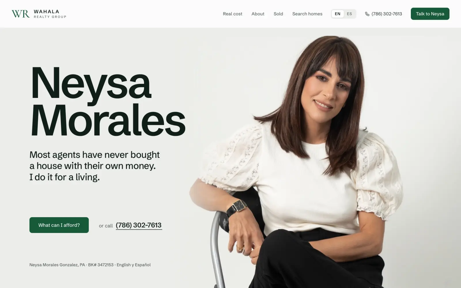
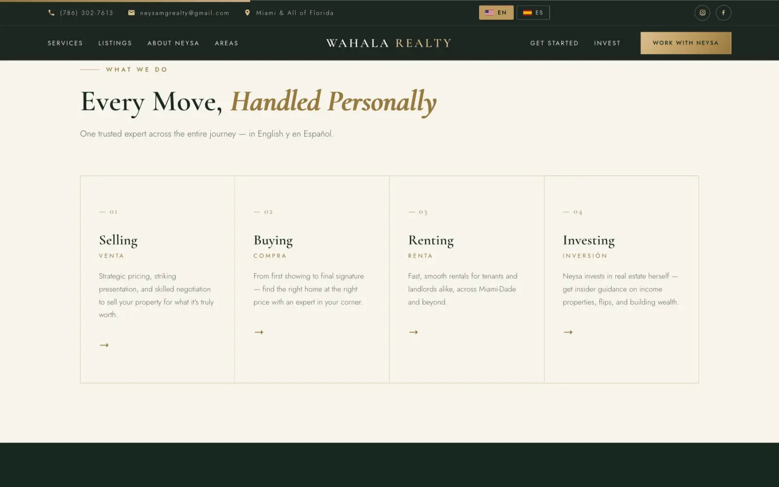
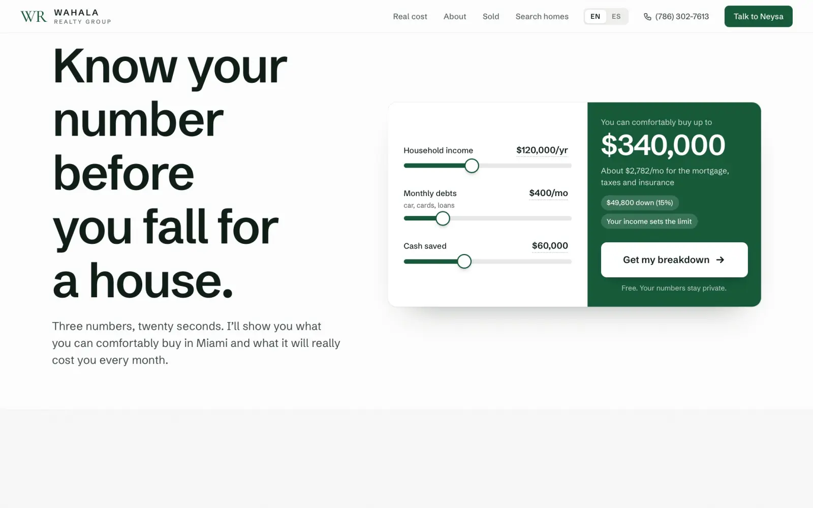
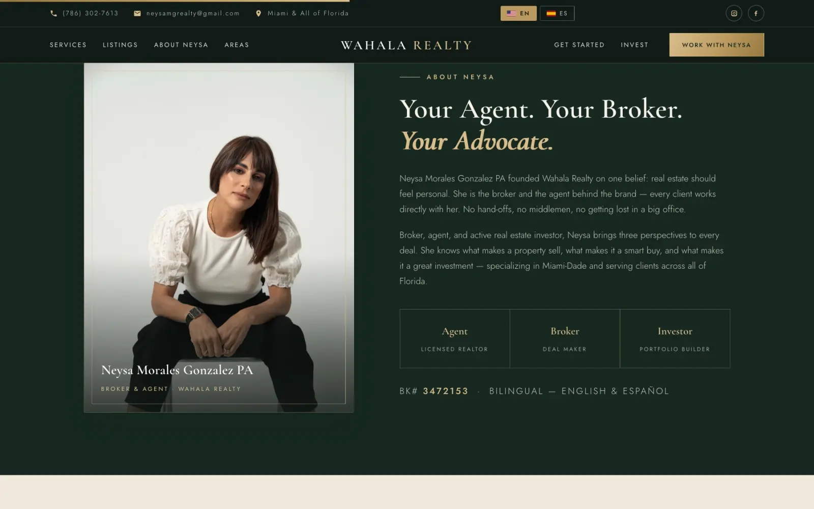
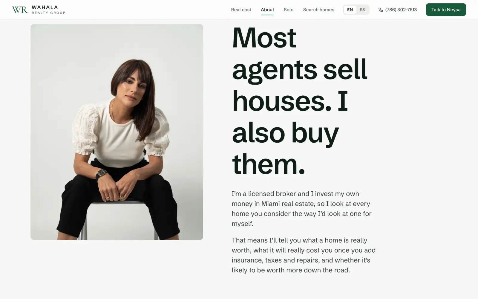
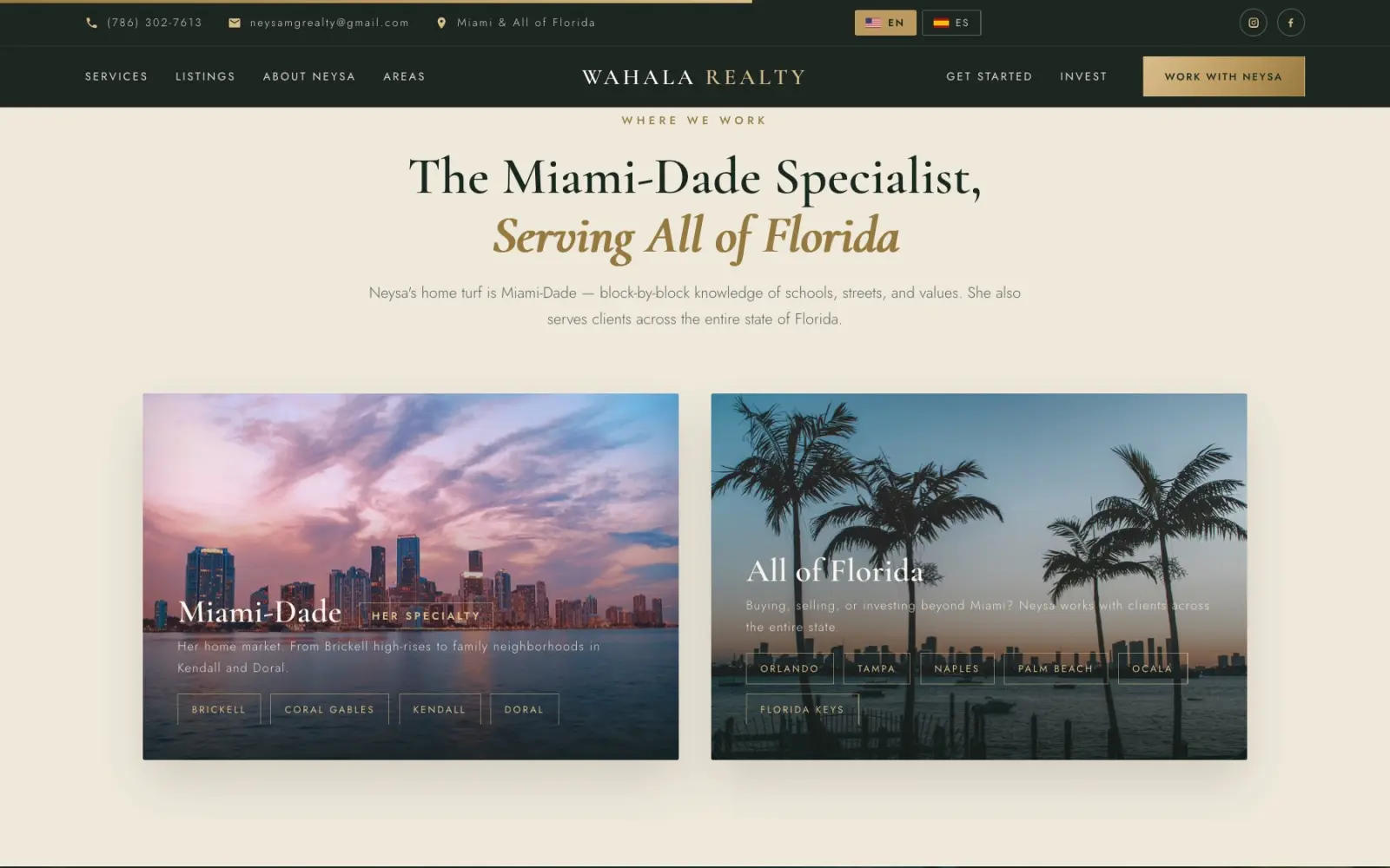
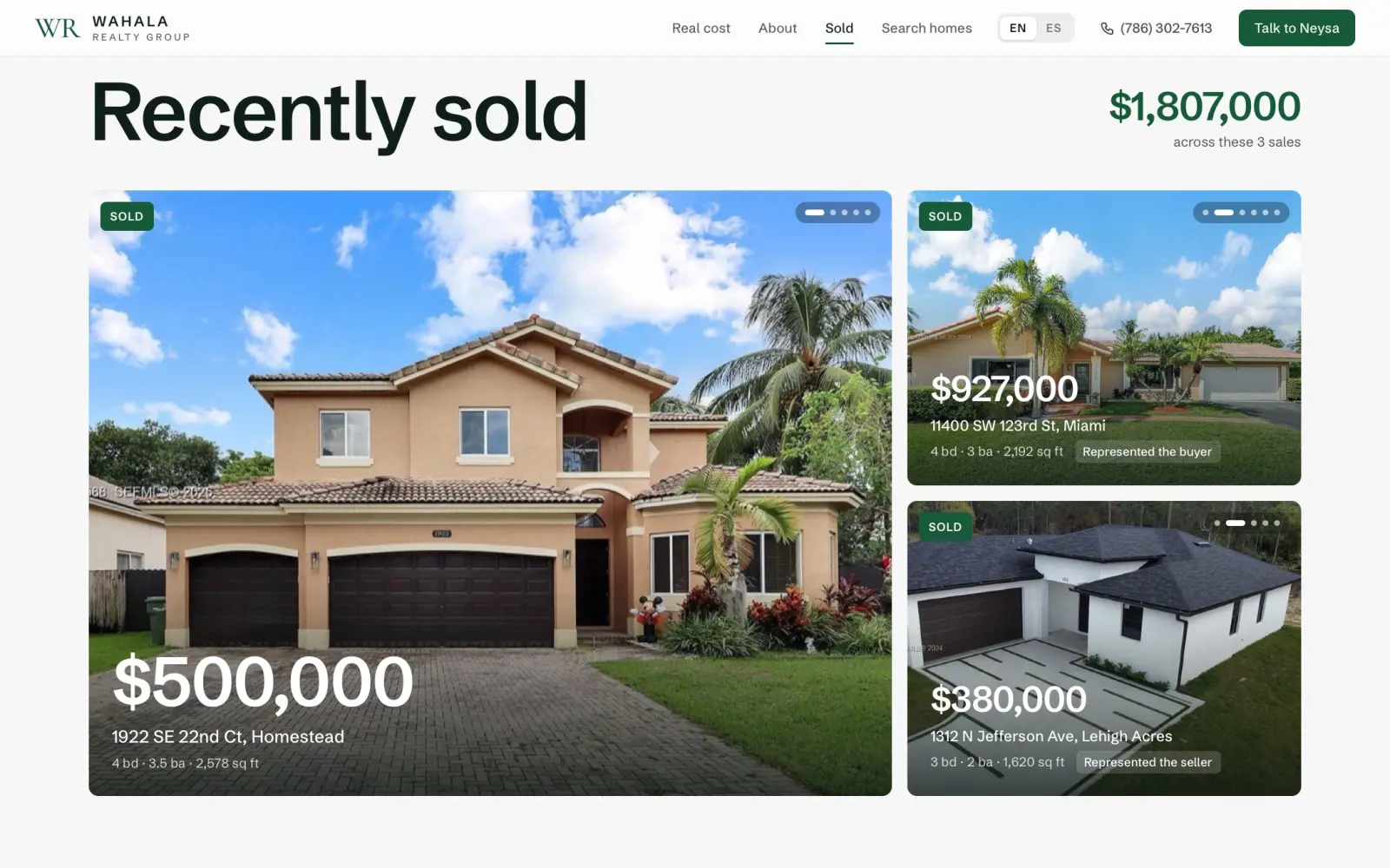
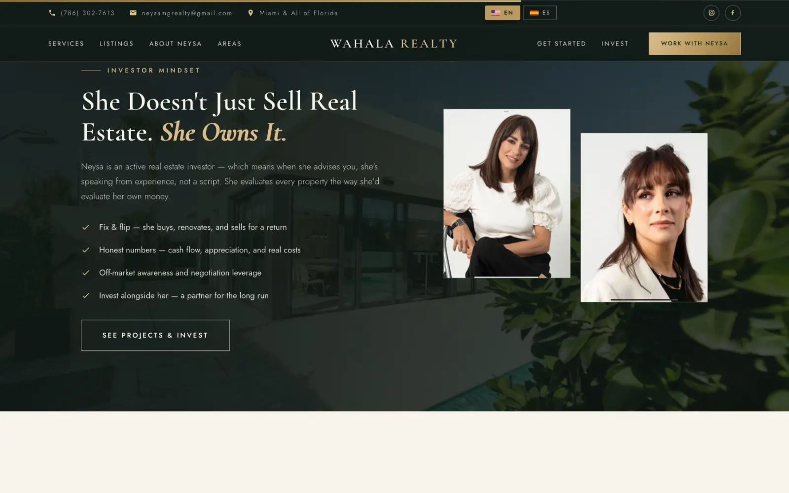
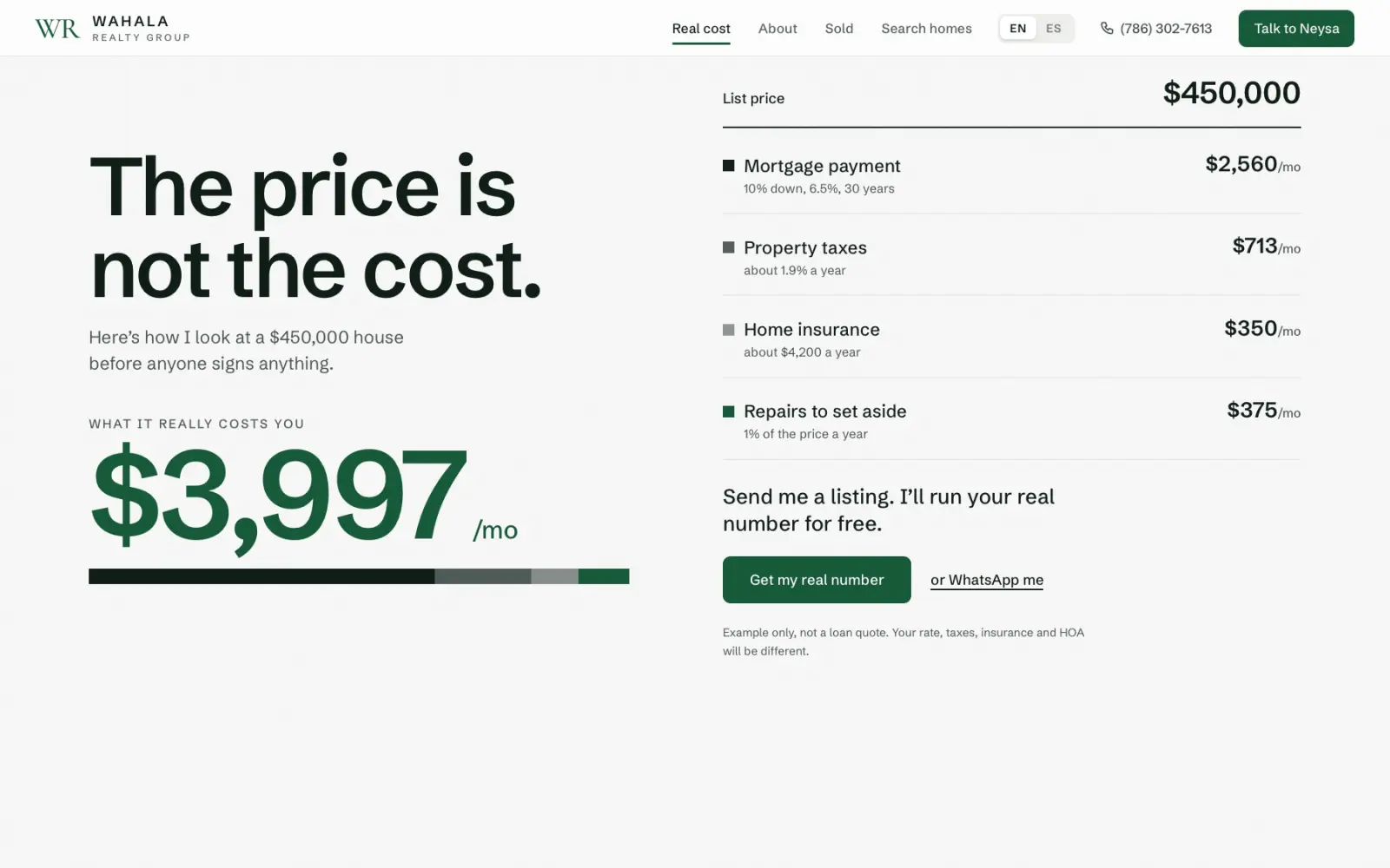
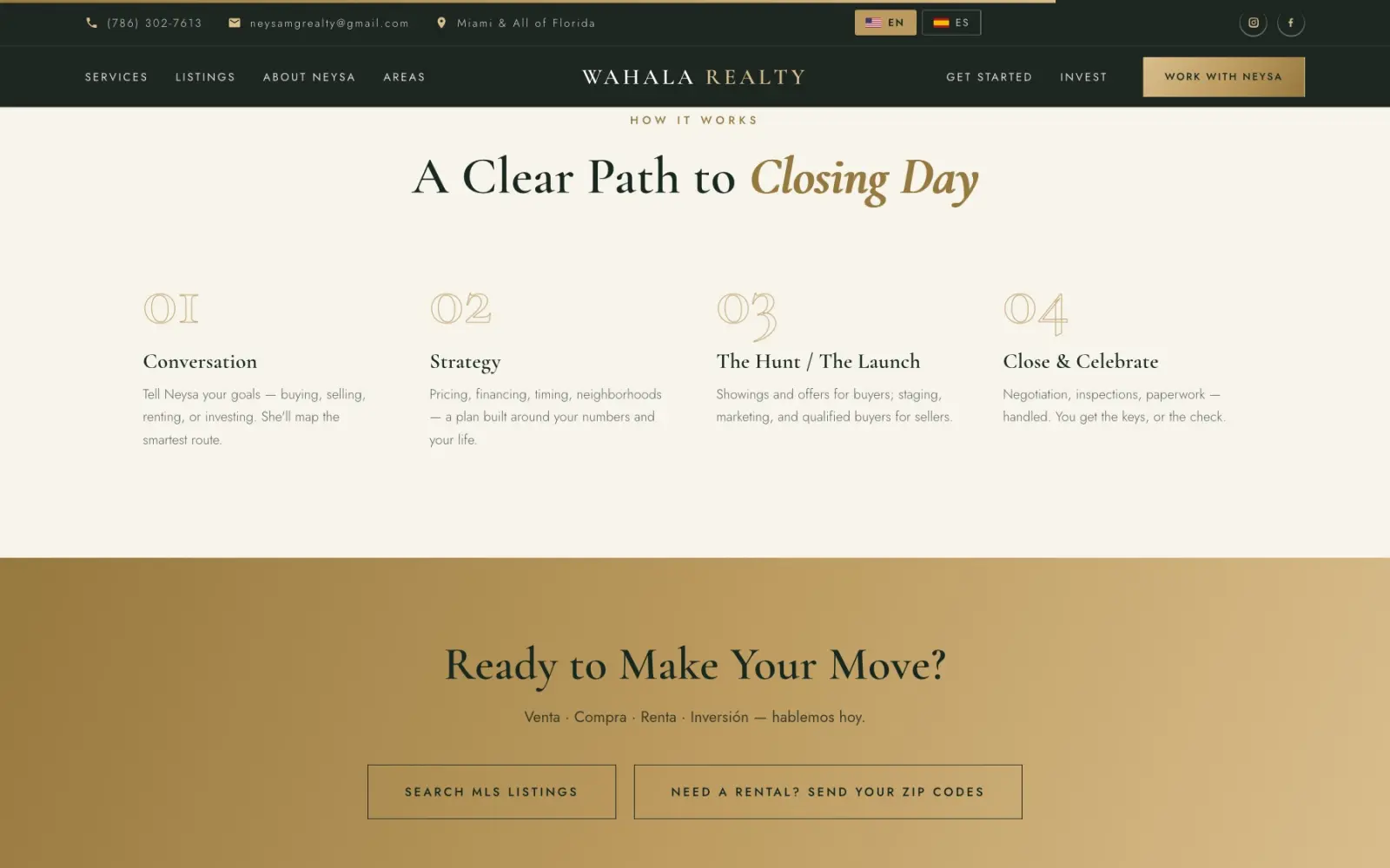
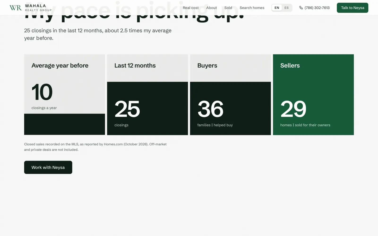
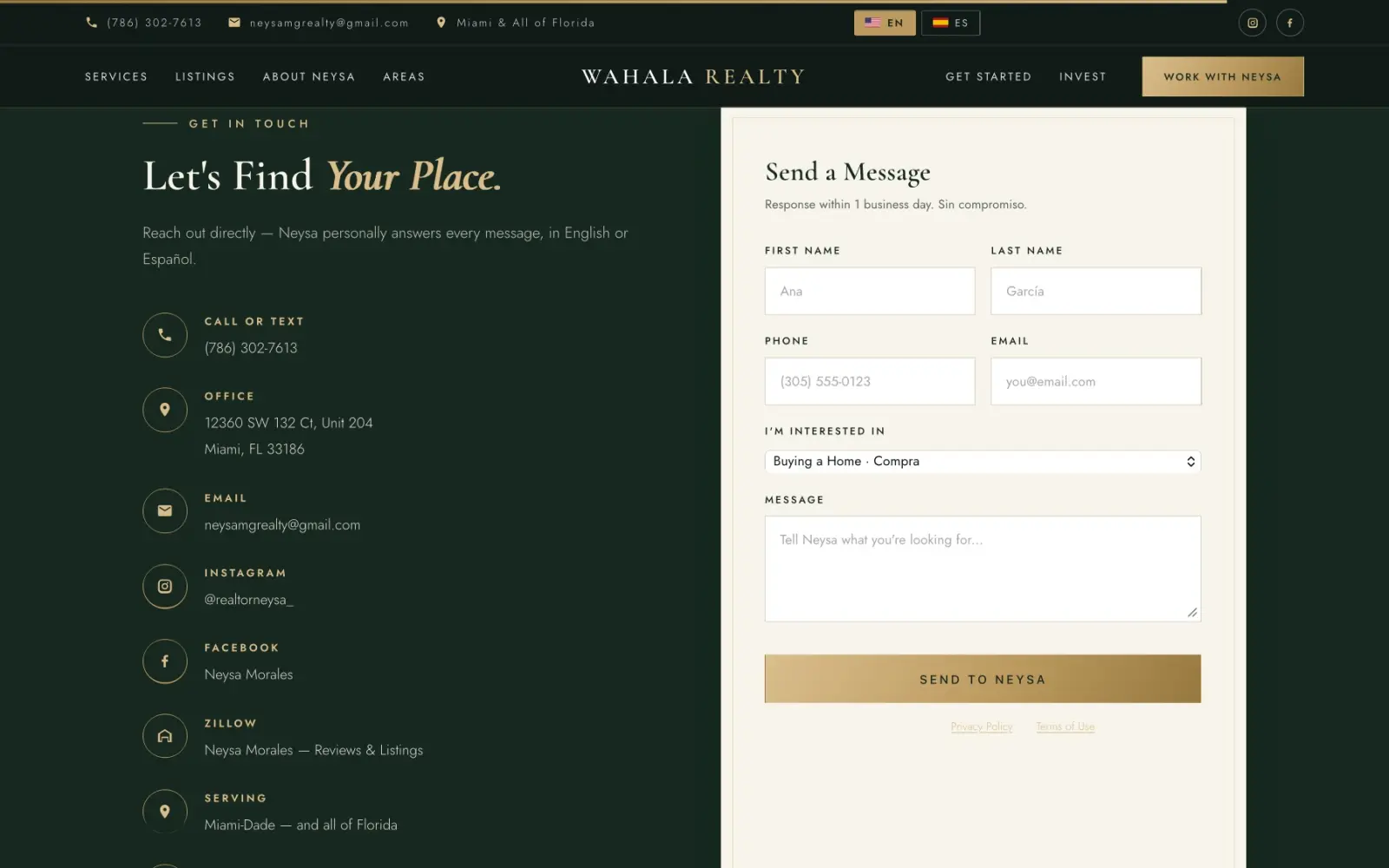
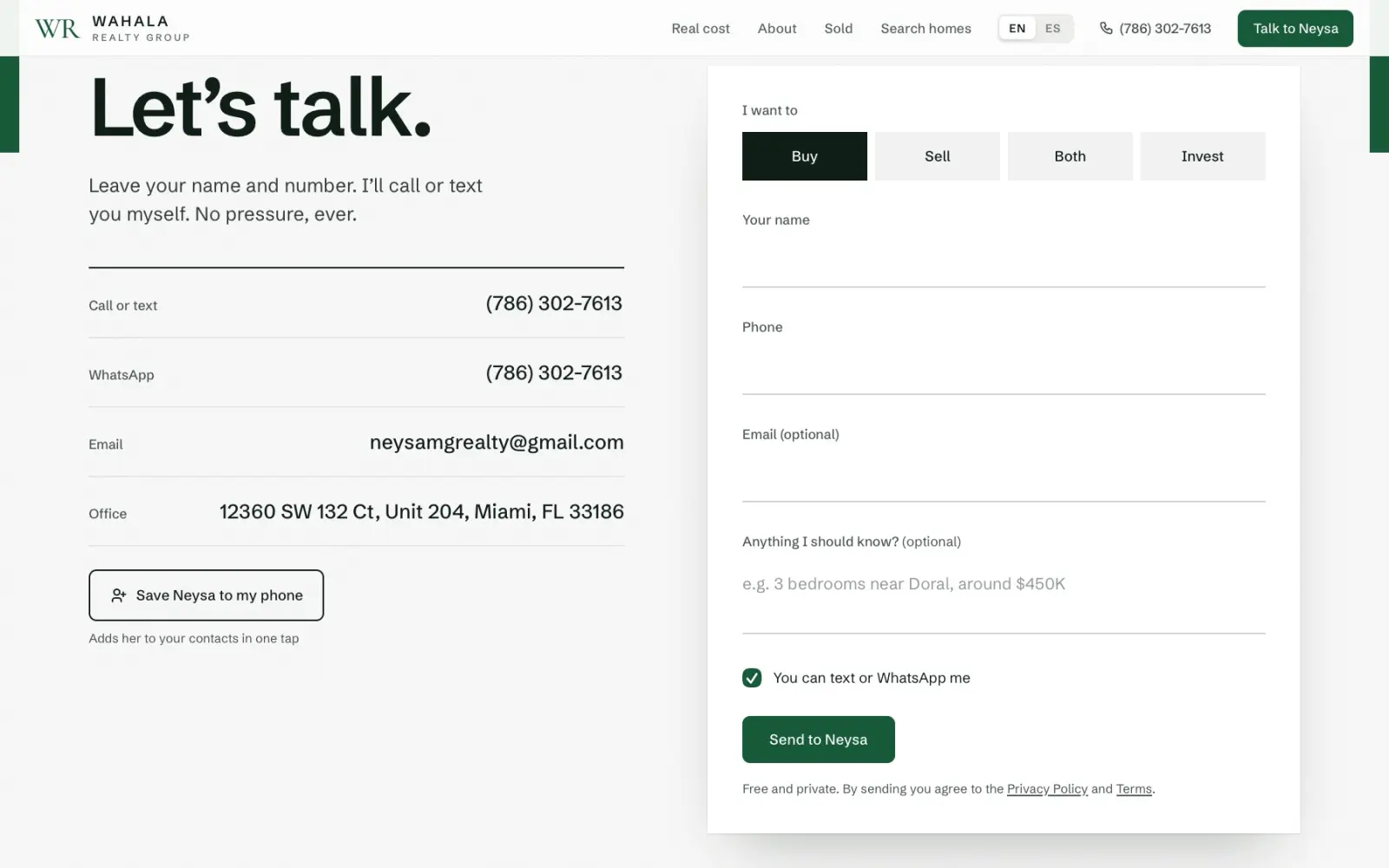
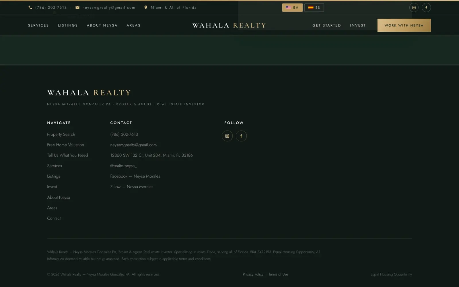
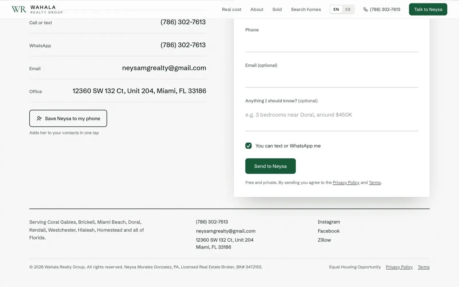
The old site looked expensive, but it was hard to read, and you had to scroll a long way to find Neysa. Here is each part, old on the left, new on the right.

On a phone.

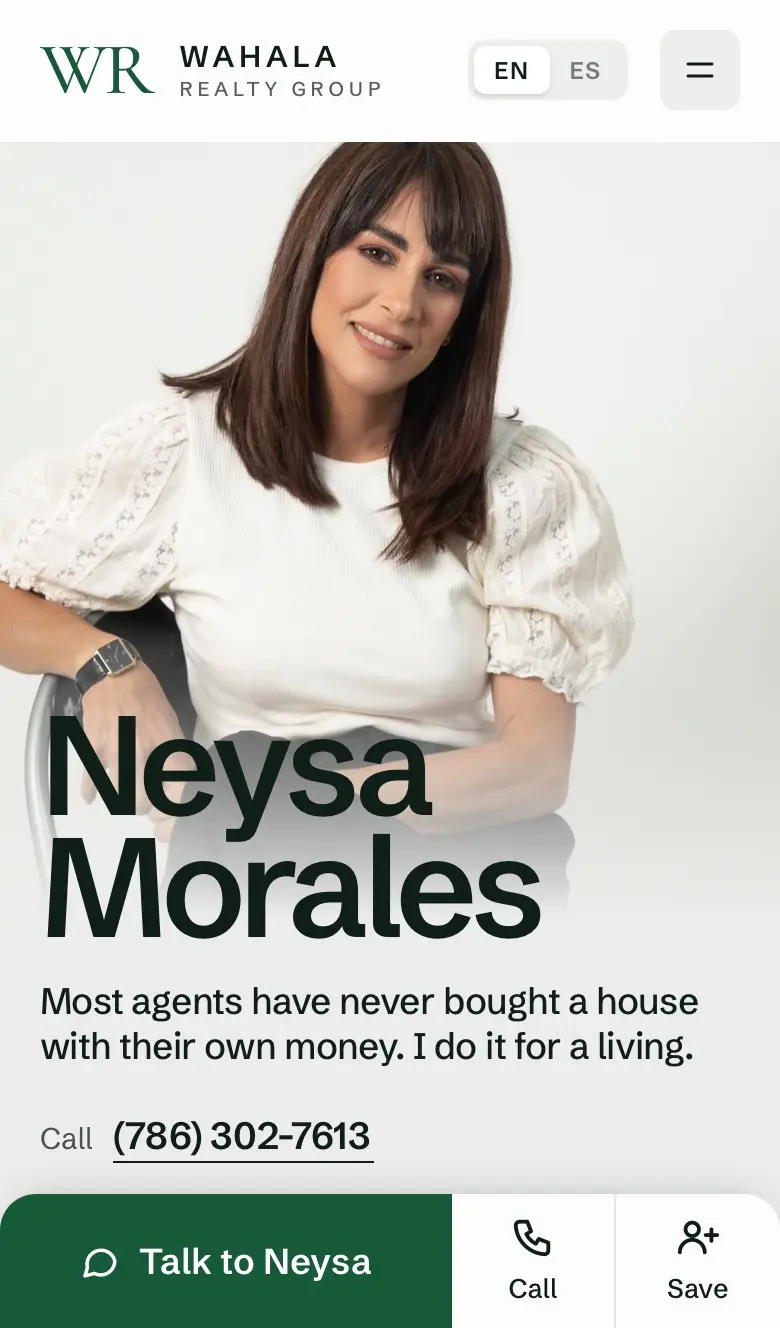
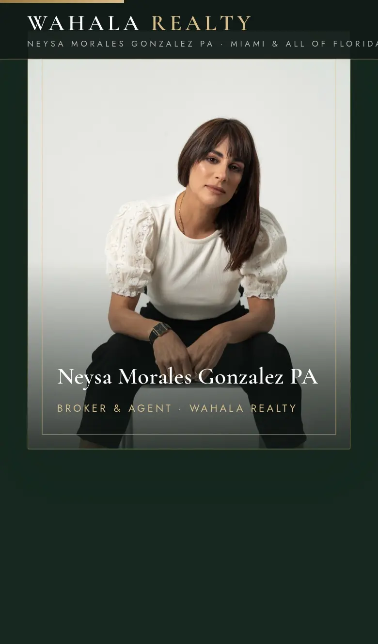
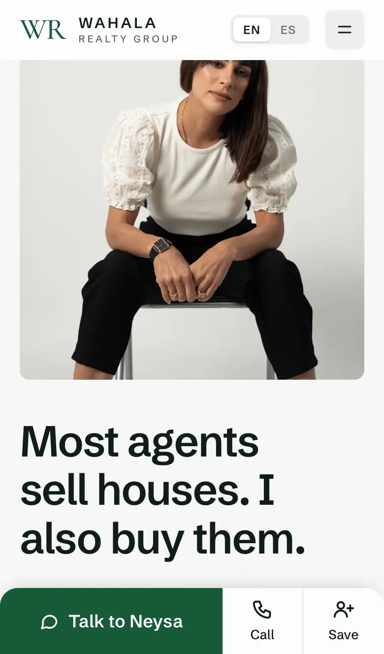

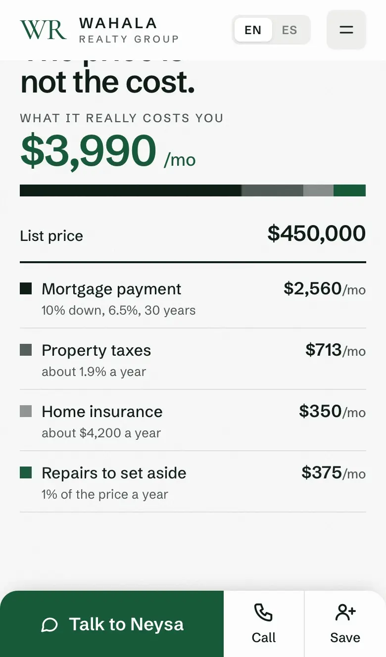
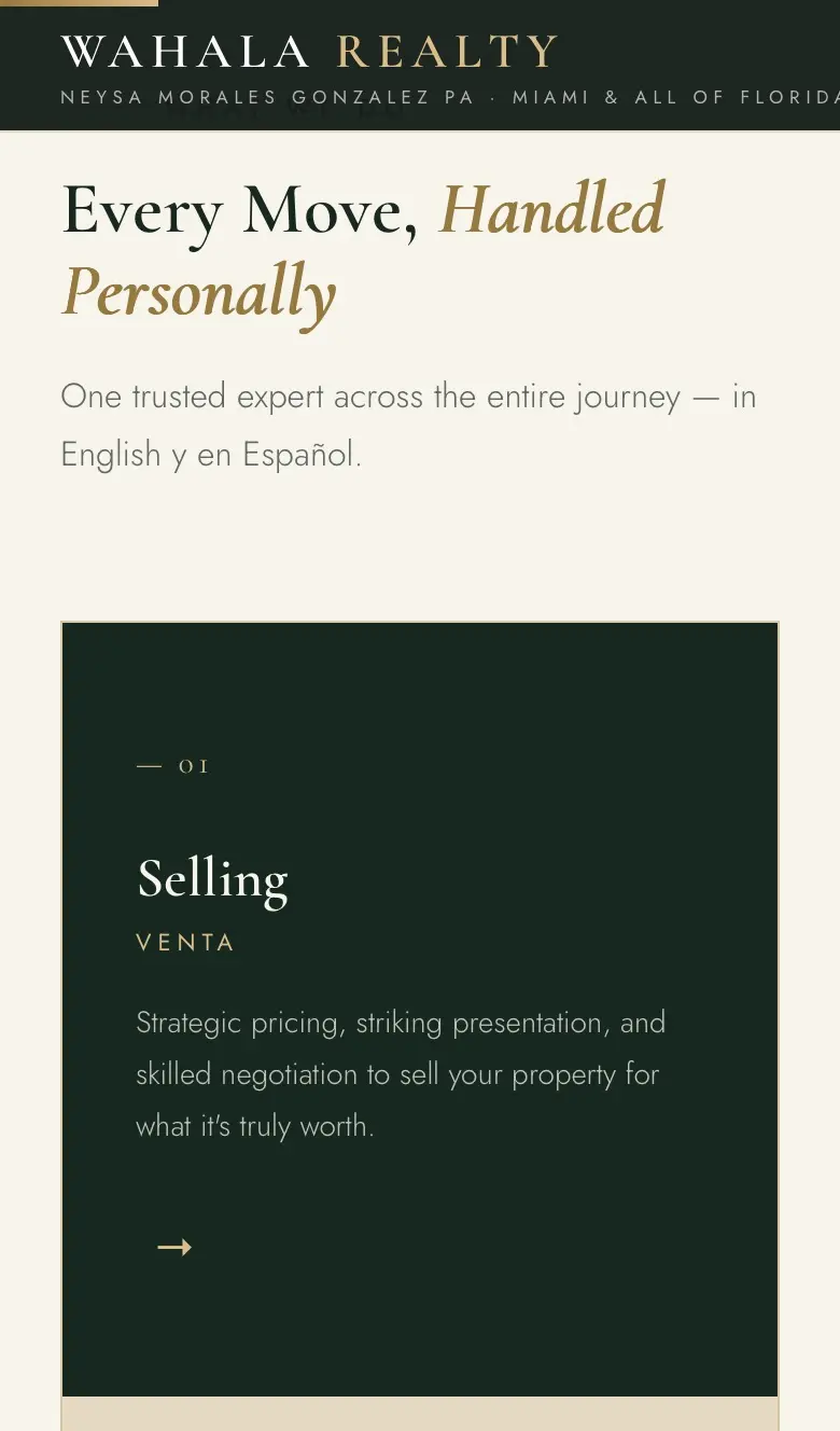
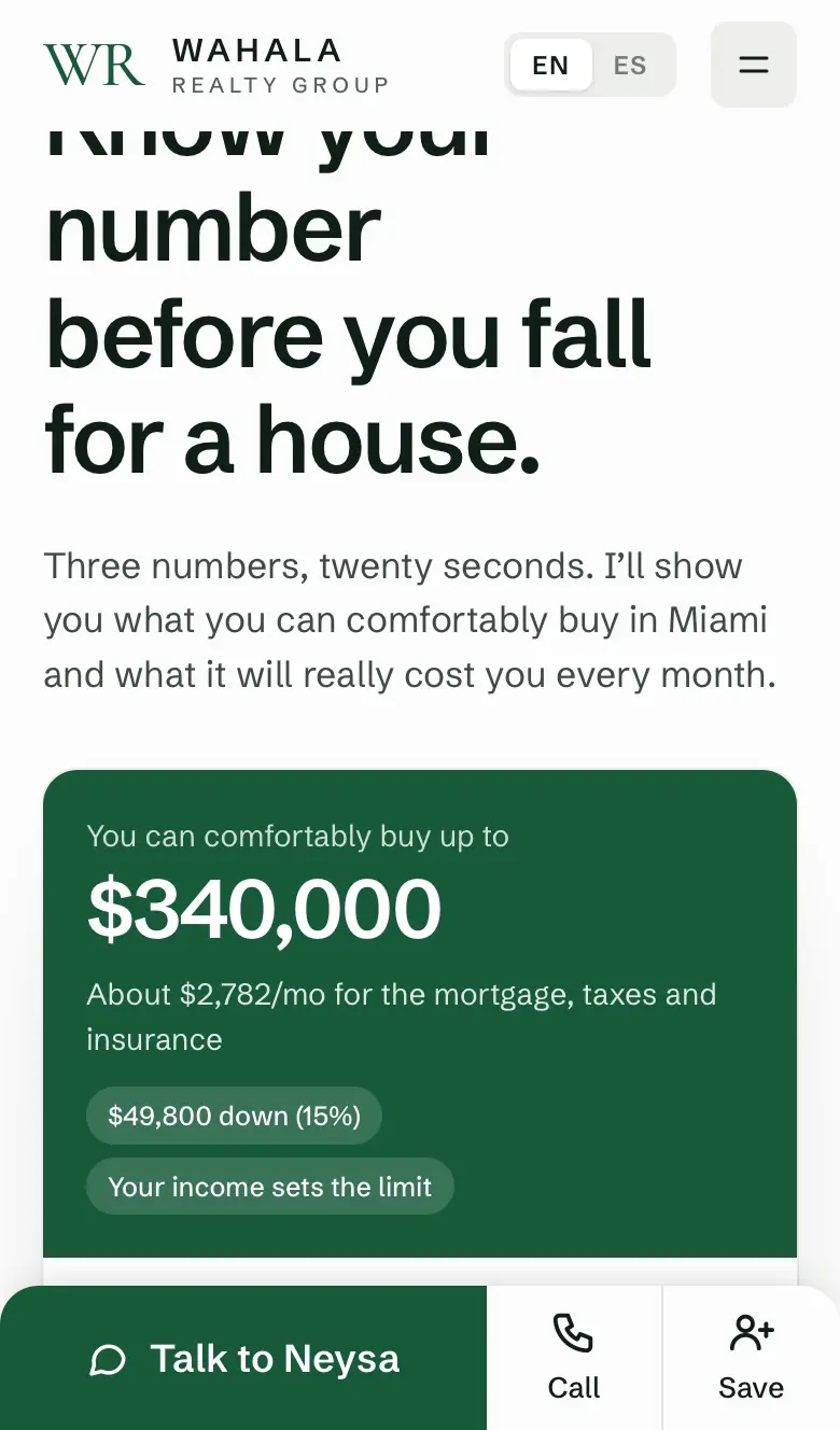
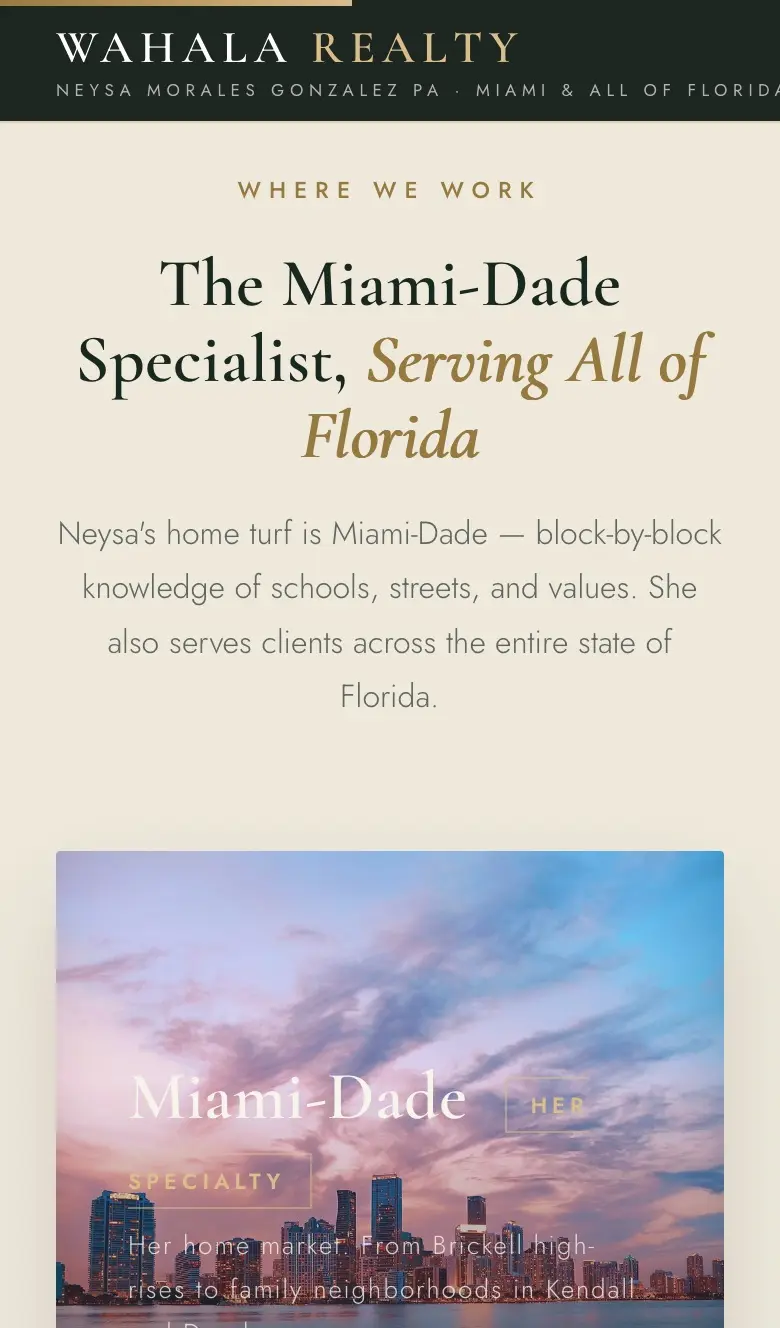
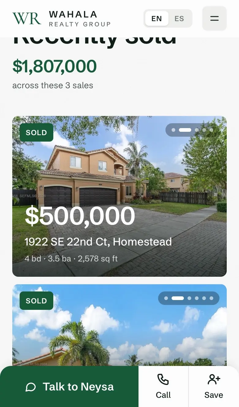
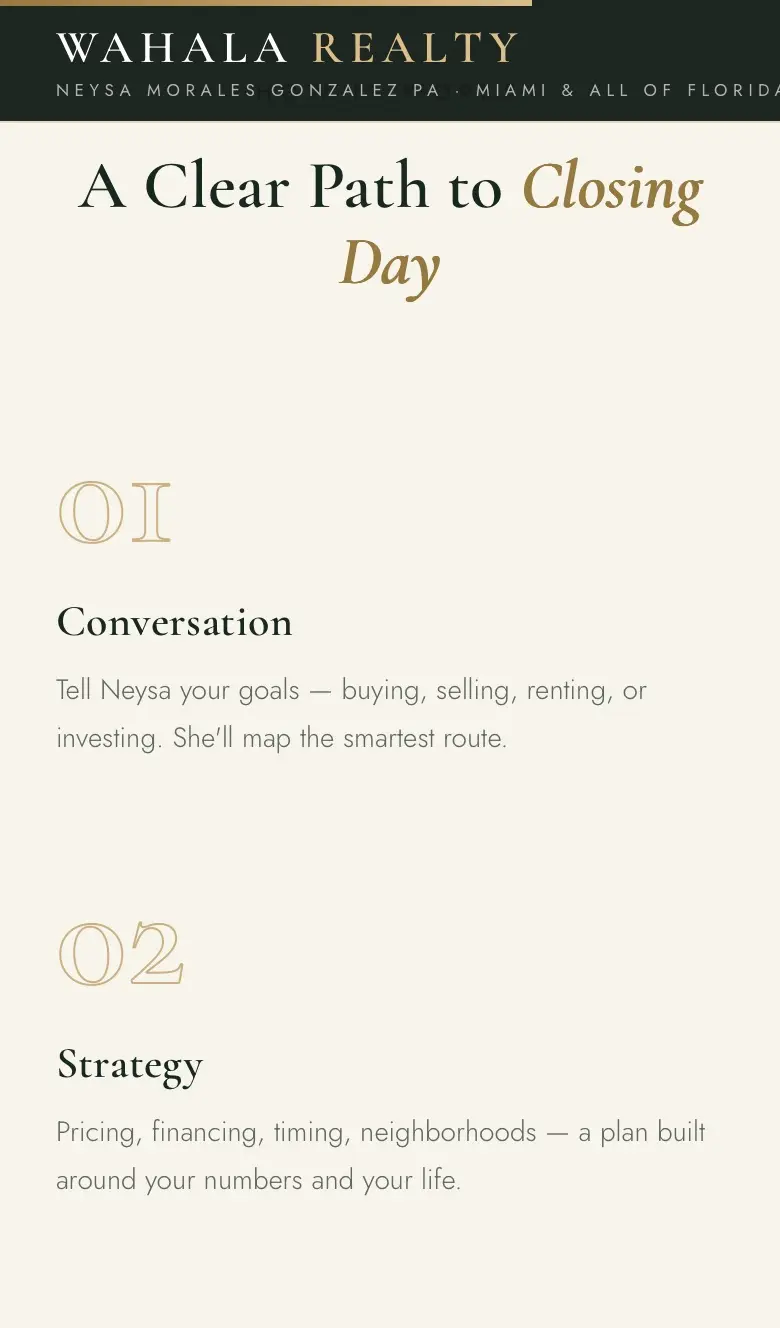
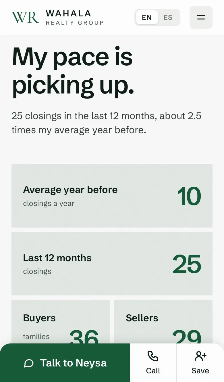

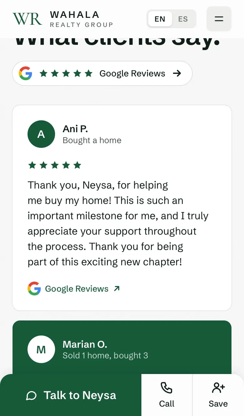
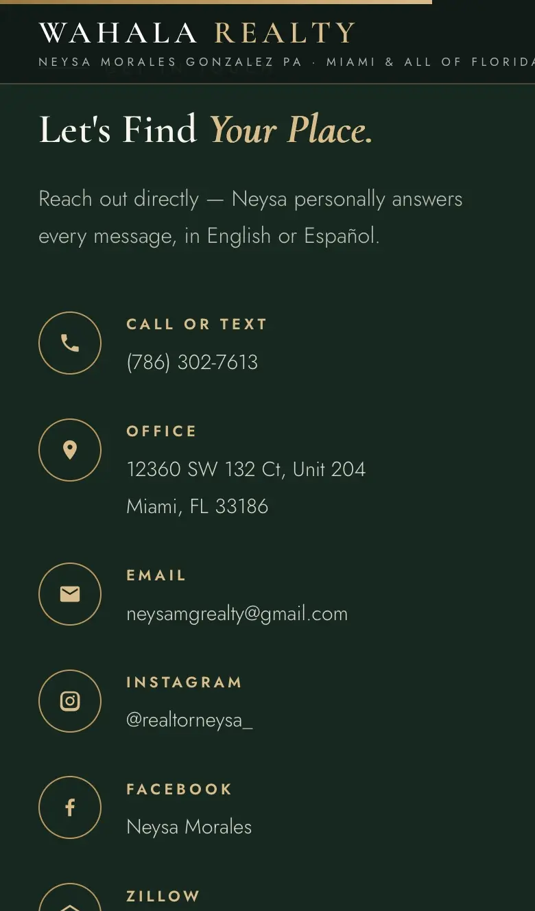
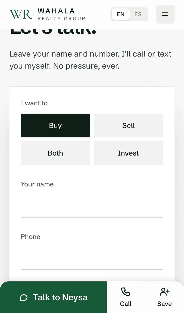
Screenshots of the old site, taken before it was replaced, next to the live site today.
Pick the colours.
Colour is the first choice, and it comes in three parts.
First, choose the base: white or black.
The base is the colour most of the page sits on. Everything else goes on top of it.
- Why not green or goldA whole page in green or gold gets tiring fast, and nothing on it can stand out.
- Most businessesPick white or black. Your photos, your text and your buttons do the talking.
- The exceptionArt, fashion and other creative work can use a real colour as the base. The colour is part of what you're selling.
Try it: pick a base
Neysa Morales
Most agents have never bought a house with their own money.
What can I afford?Then, make the contrast strong.
Contrast is how much something stands out from what's around it. It's how a visitor understands a page without thinking.
Before
After
Try it: drag to add contrast
- Contrast makes it readableDark on light, or light on dark. Text on a busy photo has neither, so you squint.
- Contrast sets the orderThe biggest, darkest thing is read first. On the new site that's her name, then one sentence, then one green button.
- Low contrast everywhereWhen everything is thin, light and the same size, nothing is first. So you read nothing.
Last, use three colours. Not more.
A base, a text colour, and one colour for buttons. Every extra colour or shade is one more thing your eye has to sort out.
Before: 4 colours, plus extra shades of them
Cream text alone came in five see-through strengths: 60, 80, 82, 85 and 88%.
After: 3 colours
Green only goes on things you can press, so your eye finds them without looking.
Decide what goes on the site.
Before any design, we list what a home buyer needs. Then every section has to earn its place.
Before
- Search the MLS
- Services
- About Neysa
- Areas
- How it works
- Contact
After
- What can I afford?The first question every buyer has.
- What will it really cost each month?Taxes, insurance and repairs, not just the price.
- Homes for sale on a mapWith a button to get matching homes sent to you.
- Homes she sold, and reviewsProof, with real photos and real names.
- Talk, Call, SaveAlways at the bottom of the phone screen.
- Who it's forThe old site was built for sellers. We turned it toward buyers.
- Why buyersAgents usually pay sites like Zillow for buyer leads. This site earns them itself.
- HowGive a buyer something useful, like what they can afford, in exchange for a name and number.
Pick a font you don't have to read twice.
Fancy letters look nice. But they slow you down.
Miami-Dade specialist · Serving all of Florida
Real Estate,
Done With Strategy.
Wahala Realty is the boutique practice of Neysa Morales Gonzalez PA, agent, broker, and investor.
Neysa
Morales
Most agents have never bought a house with their own money.
WhyHer name and one reason to pick her, in solid letters on a plain background. You read it without trying.
- Thin letters fadeThe old text was thin, light cream on a photo. The new text is solid and dark.
- Capitals are harderWe read words by their shape. ALL CAPS WITH WIDE GAPS has no shape.
- One plain fontSimple letters that don't look alike. Easier for everyone, and for people with dyslexia most of all.
Make buttons say what happens.
A button should answer a question you already have.
WhyOne main button, in the words a buyer is already thinking. The number sits right next to it for people who would rather call.
- Normal words"What can I afford?" is what a buyer is already thinking.
- One main buttonTwo buttons the same size make you choose. One makes it easy.
- Bigger textThe old button text was 12 pixels, in capitals. The new one is larger and normal case.
Pick one theme and repeat it everywhere.
The best websites have one idea they repeat on every section. After a few seconds, you know how the site works, and it feels like one thing, not a pile of parts.
- On WahalaGreen only on buttons. One thick, rounded arrow on every button that has one. On a computer, sections slide over the one before as you scroll.
- Why it worksRepetition teaches. Once you've pressed one green button, you know what every green button does.
- The rulePick one or two of these, and use them everywhere. Six different effects is noise.
Use what people already know.
There's no reason to reinvent the wheel. When something looks like what people use every day, they understand it instantly.
Always show reviews. Make them look like Google.
People trust other buyers more than anything an agent says about herself. And everyone has read reviews on Google, so we show them the way Google does.
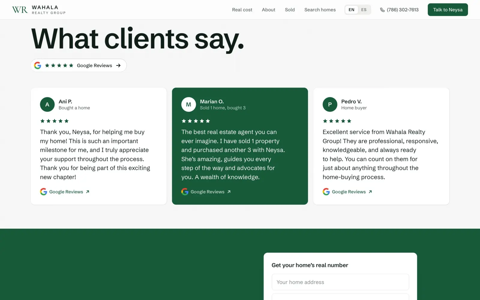
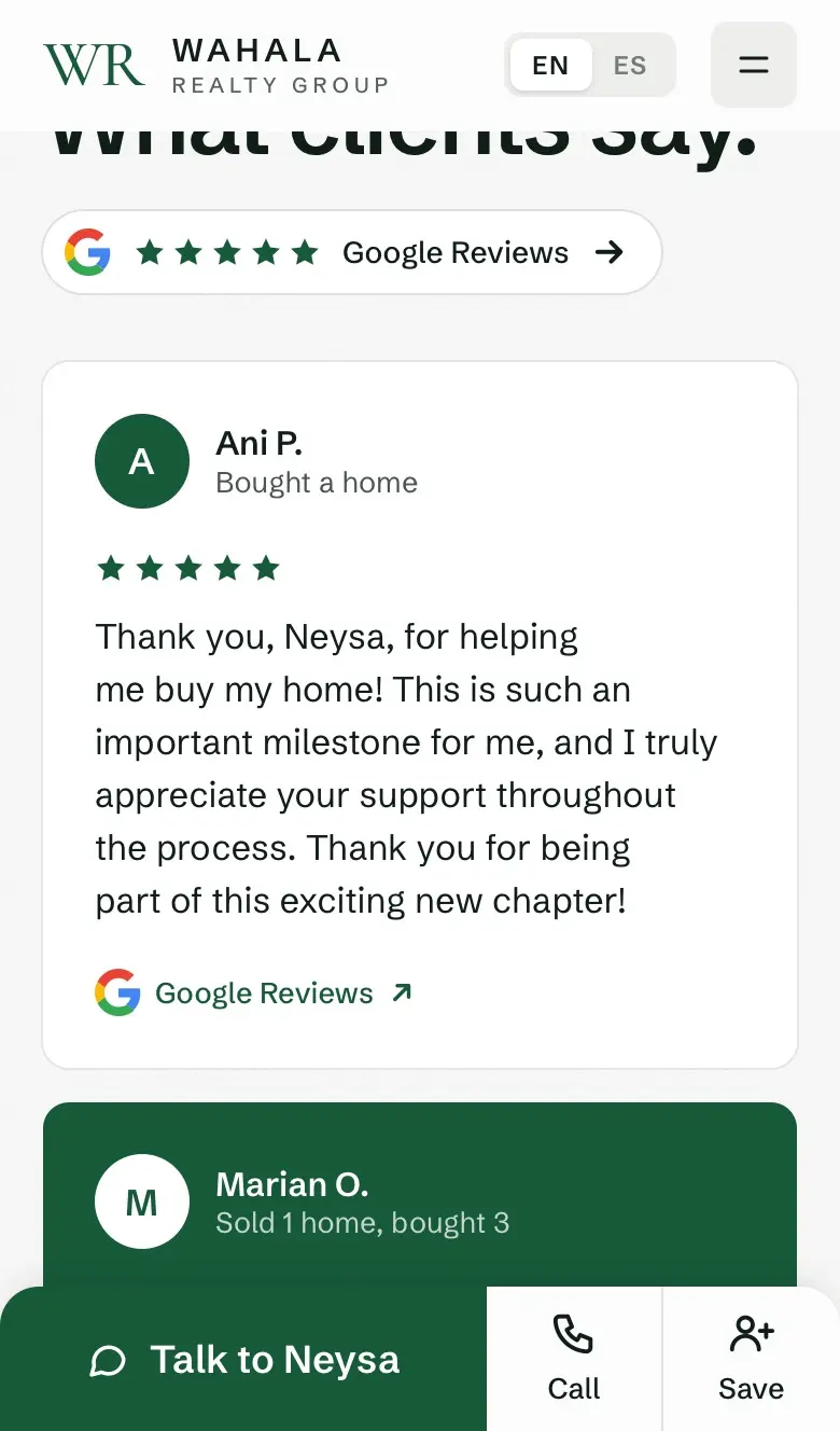
- Familiar on sightA letter in a circle, a name, five stars, the Google logo. You know what it is before you read it.
- Proof you can checkEach card opens that exact review on Google.
- Ours, not a copyGreen stars, her colours. It feels like Google, but it belongs to her site.
The rest of the page works the same way.
- Familiar is fastNobody has to figure out how anything works. They just use it.
- Familiar isn't boringThe shapes are known. The colour, the size, the photos and the care make it stand out.
- Simple, well madeEasy to use on the surface. A lot of work underneath.
Clean up the first screen.
The old photo was a busy skyline, and the text sat right on top of it. Now you see her.
WhyA face builds trust before a word is read. Now you know who you are calling.
0 words on the old first screen. 0 on the new one.
- Less to readWe cut the words nobody reads: slogans, labels, a long paragraph.
- Nothing behind the wordsText on a plain background reads itself. Text on a photo makes you work.
- A faceYou see who you'll work with before you read a word. That's trust.
Show her face, more than once.
Most real estate sites show a city skyline or a row of houses. You could swap in any agent's name. Here you see Neysa, again and again, so by the end of the page you feel like you've met her.
- People hire peopleBuying a home is personal. You want to know who's on your side before you call.
- A picture in your headA face is remembered. A skyline isn't. Days later, you remember her, not the site.
- Every time she asksWhen the page asks you to reach out, her face is right there. It's a person asking, not a form.
On a phone, her photo and her name read as one.
The first phone version was two separate boxes: a short photo, then her name under it. Evan called it "a bit boring". We built three new versions in the real site.
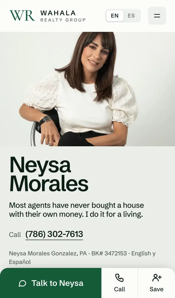
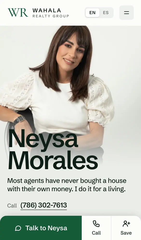
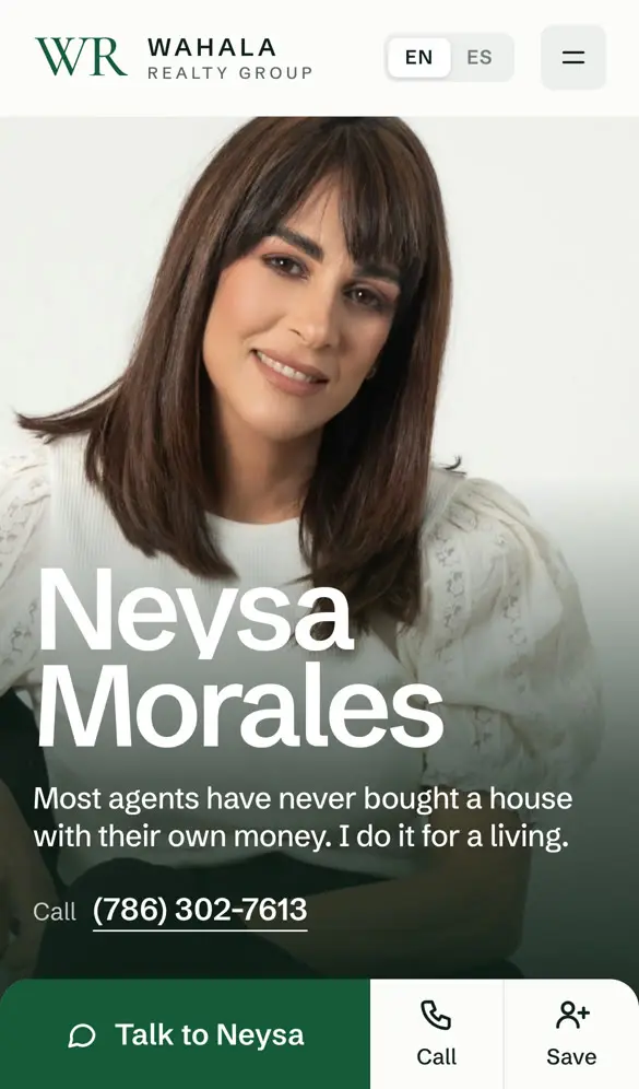
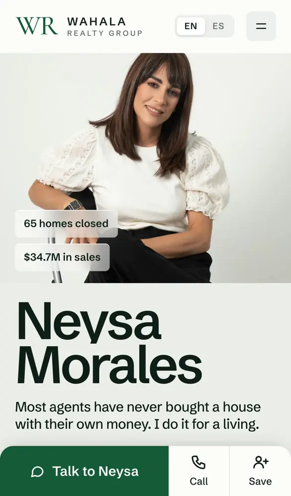
- One pieceThe photo is taller and its bottom fades into the page. Her name sits on the fade, so face and name read together.
- Why not BA full-screen face stops being a portrait and becomes a close up, in a darker mood than the rest of the site.
- Why not CIt kept the two boxes, and its tags repeated numbers already shown right below.
We tried three first screens.
Our first version put a three-box calculator right in the hero. Her face, her promise and a form were all asking for attention at once.
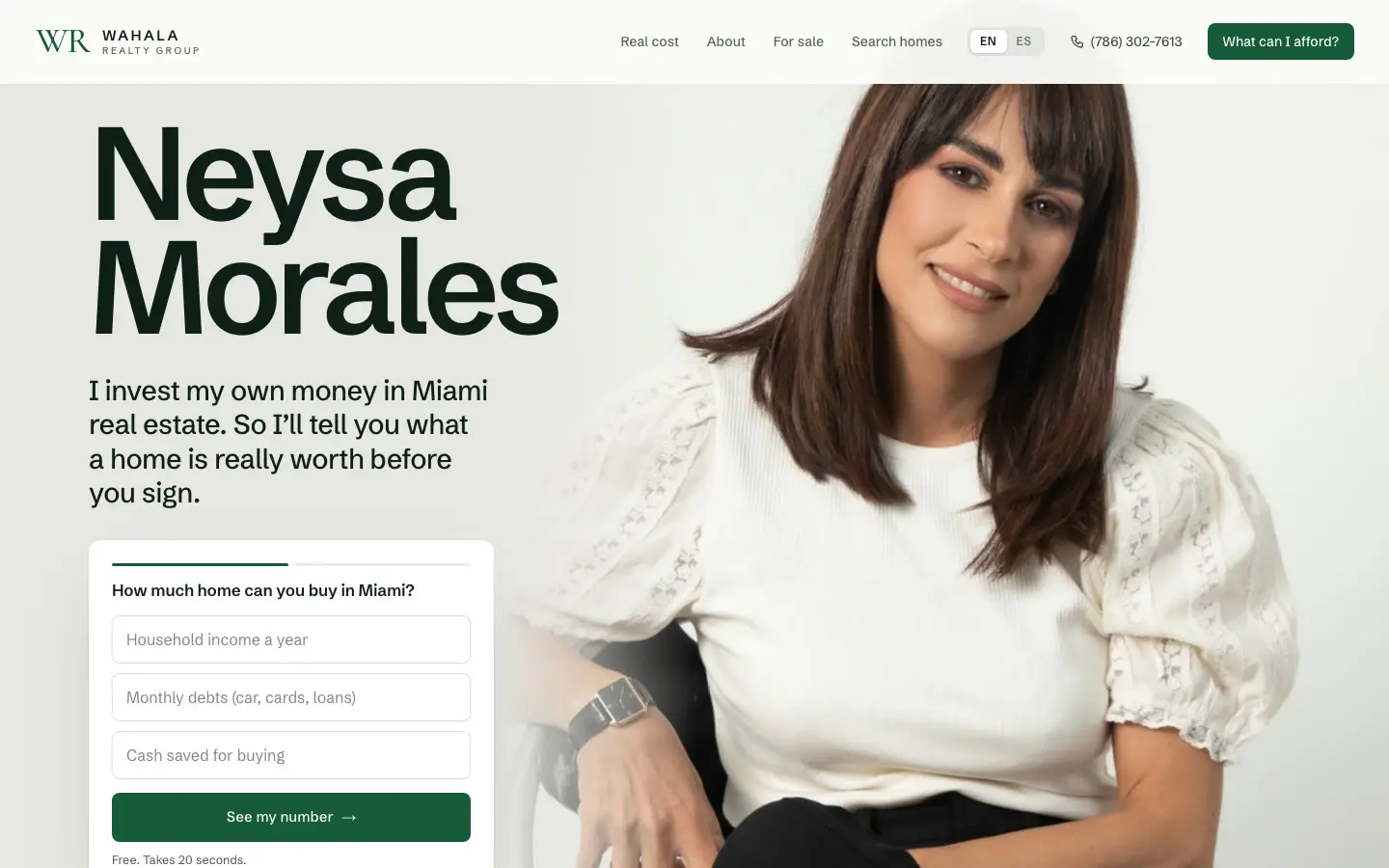
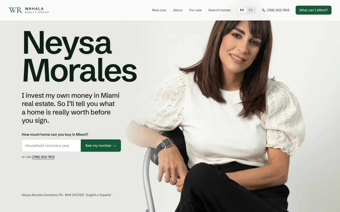
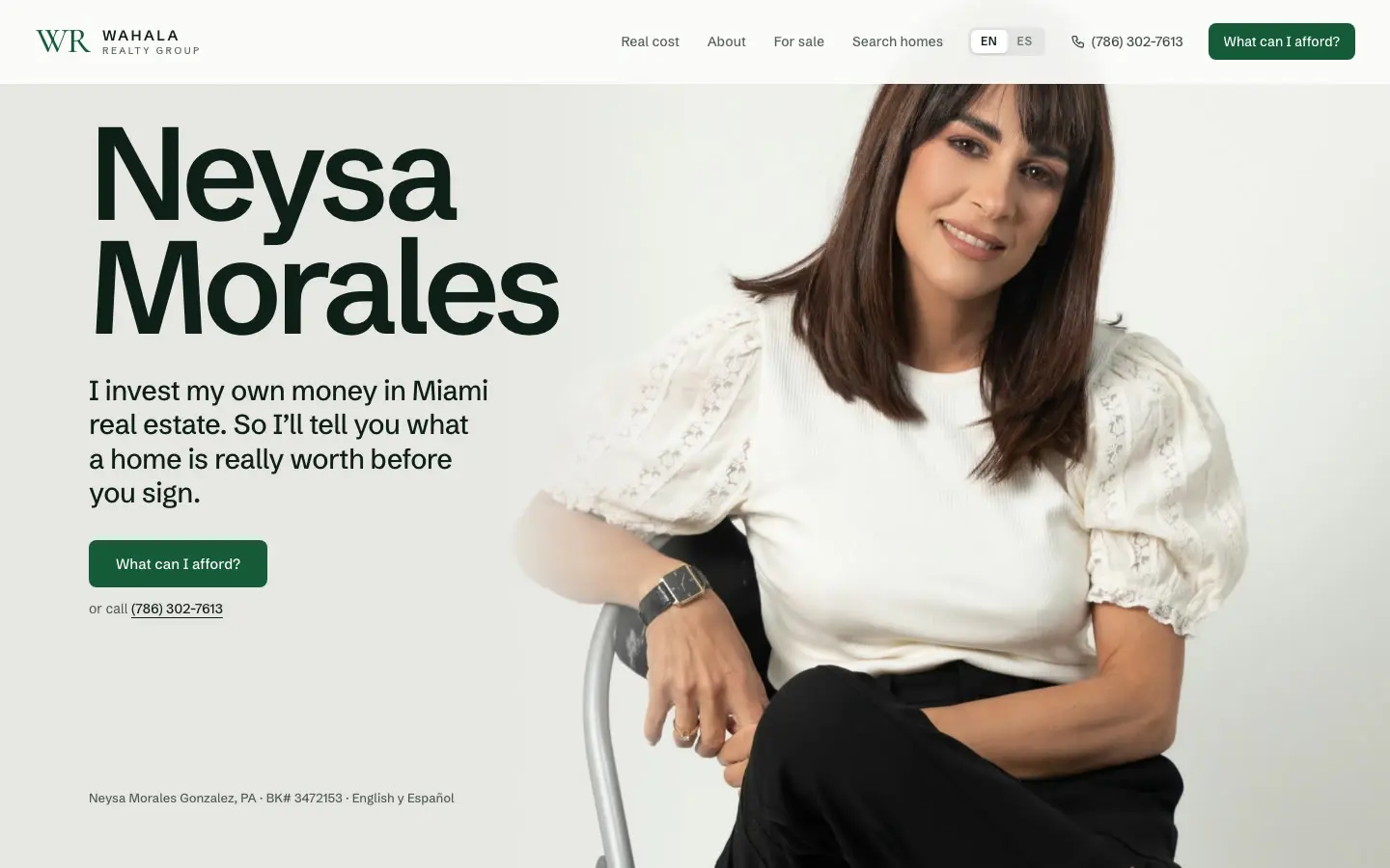
Why it works
A face builds trust before a word is read. So the first screen only introduces Neysa and her promise. The calculator moved to its own section, under a headline that says why it's worth using.
Details you won't notice
- The photo starts below the menu, so her head is never cut off on any screen.
- The background is the exact grey of her photo's backdrop, so no edge shows.
- We removed a soft fade at the top so her hair stays sharp.
Design for the phone first.
Most people will find her on a phone. So every section was designed for a phone screen, not squeezed down from a computer.
- One columnNothing side by side that has to shrink. You read straight down.
- Big enough to tapButtons and choices are sized for a thumb, not a mouse.
- The bar never leavesTalk, Call and Save sit at the bottom of every screen above.
Make it easy to become a client.
A pretty site isn't the goal. The goal is more clients for Neysa. So every part of the page pushes a visitor one step closer to calling her.
Her contact is always under your thumb.
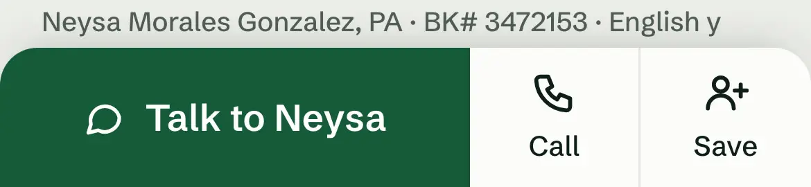
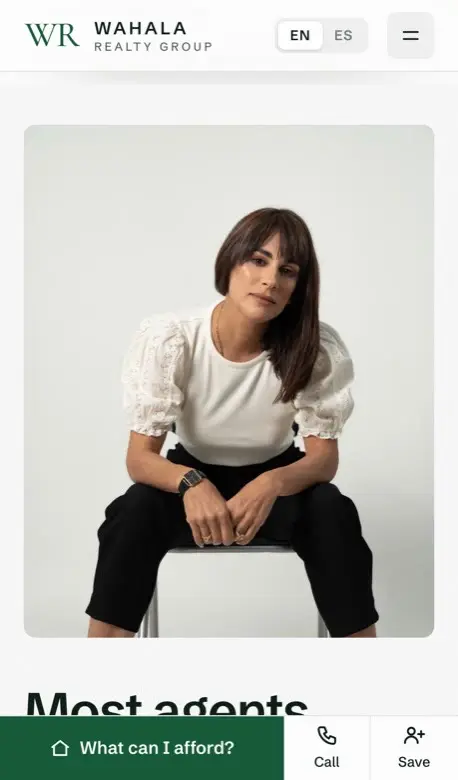
If you have to look around to contact someone, you give up. On a phone, Talk to Neysa, Call and Save stay at the bottom of the screen the whole way down.
WhyHer number on the first screen, and Talk, Call and Save at the bottom of every screen. Nobody has to look for her.
The page moves. The bar doesn't.
Wherever you stop, Talk to Neysa, Call and Save are one tap away.
- Talk to NeysaOpens a short form, right there. No new page.
- CallOne tap and your phone dials her.
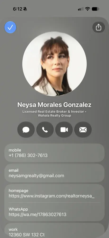
- SaveOne tap and she's in your contacts, with her photo, number, email, WhatsApp and office.

What happens when you tap Save
Your phone opens her full contact card. Tap the check, and she's saved.
Days later, when you're ready to buy, you don't have to find the website again. She's in your phone, next to your friends.
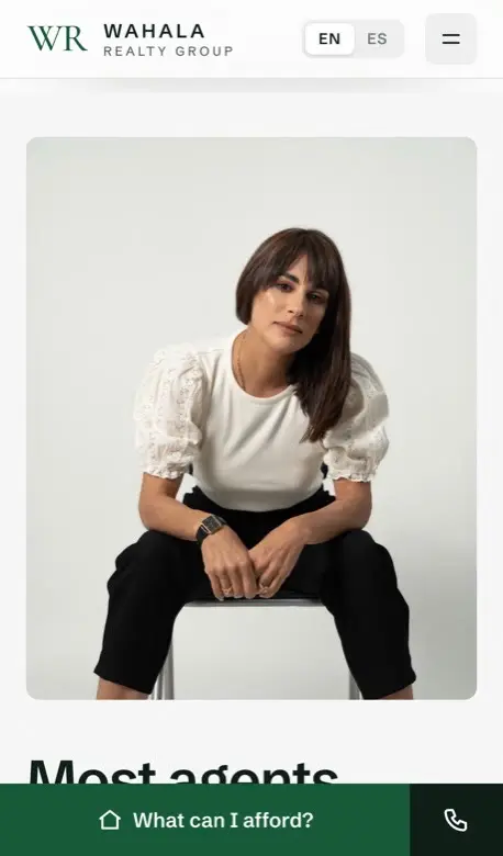
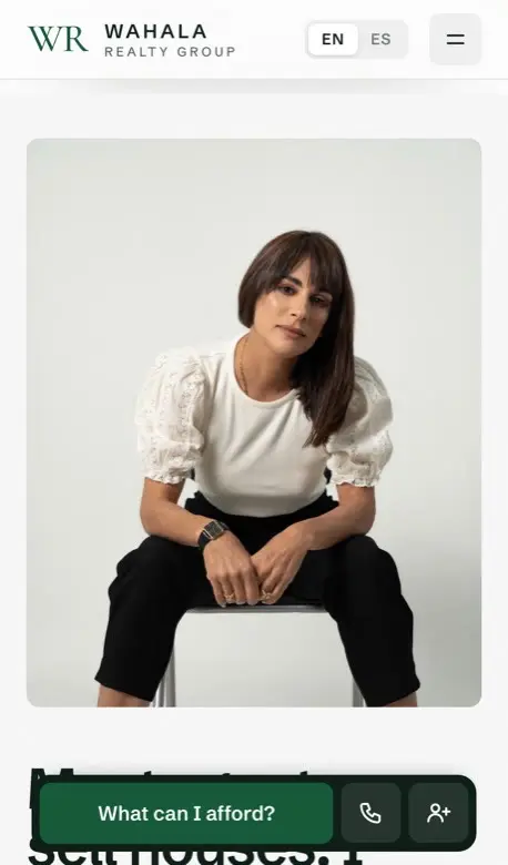
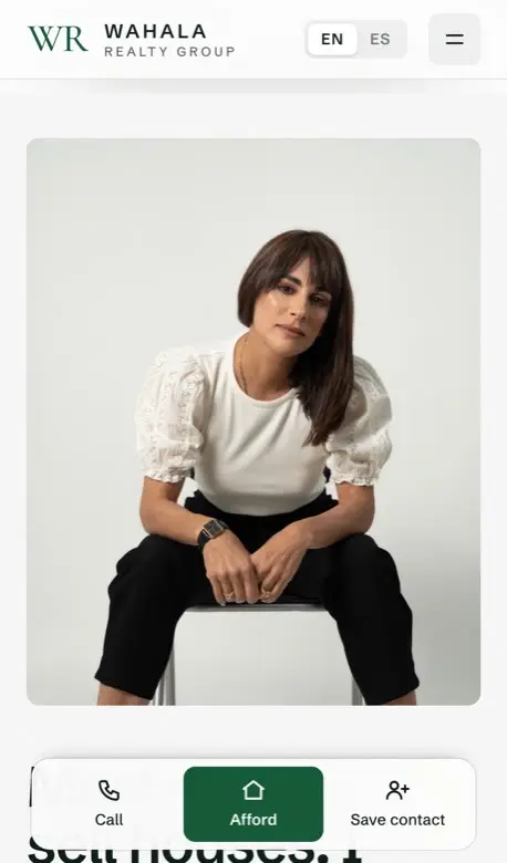
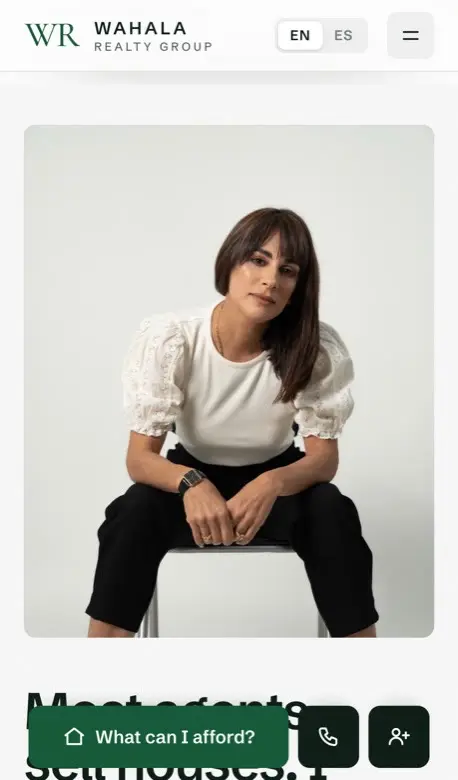
We tried five versions of the bar.
On a phone, a visitor who scrolls halfway down has to scroll all the way back up to find a way to reach her.
Why it works
Three actions stay at the bottom edge, where the thumb already rests: Talk to Neysa, Call, and Save. Save puts her in your phone's contacts with one tap, so she's still there after you close the site.
Details you won't notice
- Attached to the edge, not floating, so it never covers the page.
- Thin lines divide the three, not separate boxes.
- The Spanish label was getting cut off, so we measured it on four phone sizes and sized each language to fit.
A button in every section.
Wherever you stop reading, there's a next step right there. Each button says what you get.
- First screenWhat can I afford?
- Know your numberGet my breakdown
- Most agents sell housesTalk to Neysa
- The price is not the costGet my real number
- Search every homeSend me matching homes
- My pace is picking upWork with Neysa
- Recently soldFind my price range
- Already own a home?Get my home value
A free answer, in exchange for a name.
The calculator tells you what you can afford for free. The full breakdown (down payment, cash to close, every monthly cost) asks for your name, phone and email. You get real value. Neysa gets a buyer who's actually interested.
- The usual wayIn real estate, agents buy leads from Zillow and the MLS, and pay a lot for them.
- Our wayGive people a useful tool on her own site. They type their details in willingly, because they want the answer.
- Why it's betterThe lead is hers, it costs nothing per person, and the buyer already knows their budget.
A friendly pop-up, later.
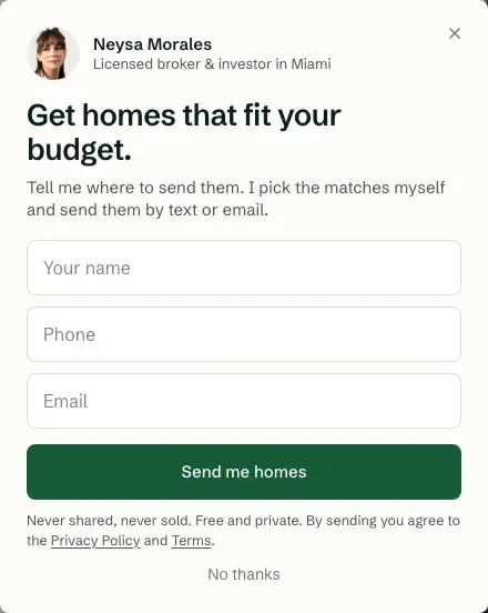
After someone has read most of the page, a short note from Neysa offers to send homes that fit their budget. It waits, it shows rarely, and never to someone who already wrote to her.
The same idea works for any business.
Think of a small free tool your customers want. Let them use it, and send the full result to their email or phone, as a PDF or a text.
- A mortgage broker"What will my payment be?" with the full plan sent as a PDF.
- A contractor"Roughly what will my kitchen cost?" with the estimate sent by text.
- A restaurant"Plan a party for 20" with a menu and price sent by email.
Show proof, not labels.
Anyone can call themselves a specialist. Real numbers and real homes she sold are things a buyer can check.
Closed sales on the MLS, as reported by Homes.com.
WhyBig, solid numbers with where they come from. Proof you can read in a second, and check.
WhyA real home she sold, with its price. Proof beats a pretty picture.
Why it works
Homes she actually sold, with their prices, are proof. We could have made nicer pictures with AI. We didn't: a made-up photo of a real house is misleading for a licensed broker. We asked the listing agents for permission and used the real photos.
Details you won't notice
- The photos flip by themselves, and stop while you're touching a card.
- The $1,807,000 total is added up from the three prices, not typed in.
- Every stat on the page names its source, and private deals are left out.
Make several versions. Keep one.
For every important part, we built a few versions side by side, picked the best, and threw the rest away.
The calculator.
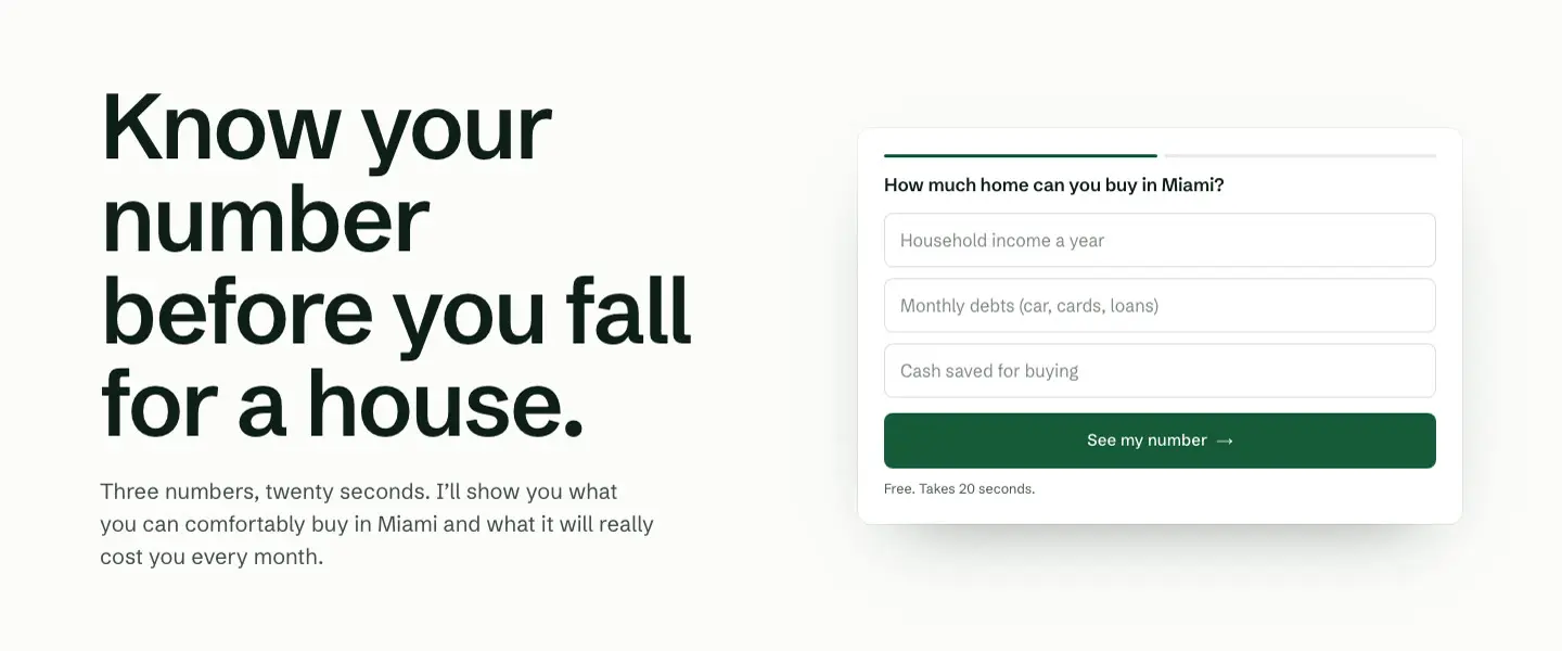
Three empty boxes feel like homework. Nobody wants to type their income into a blank form.
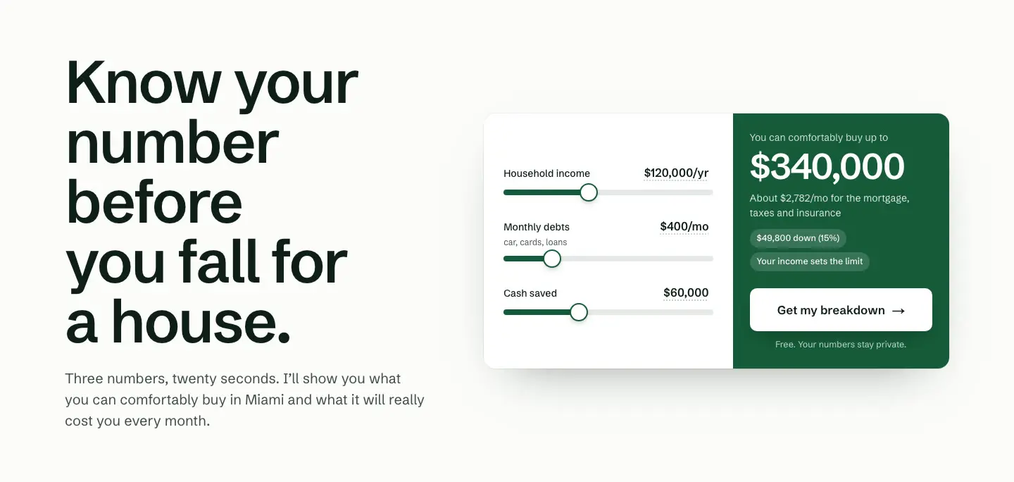
Why it works
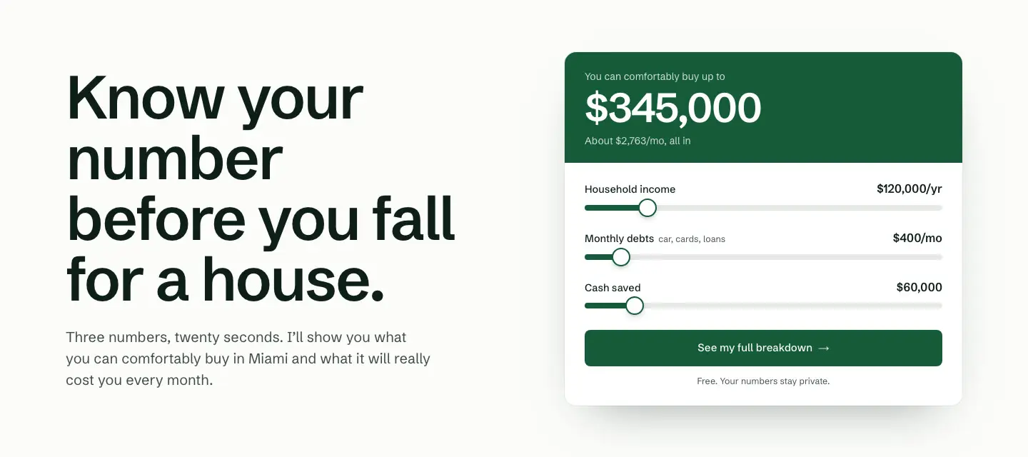
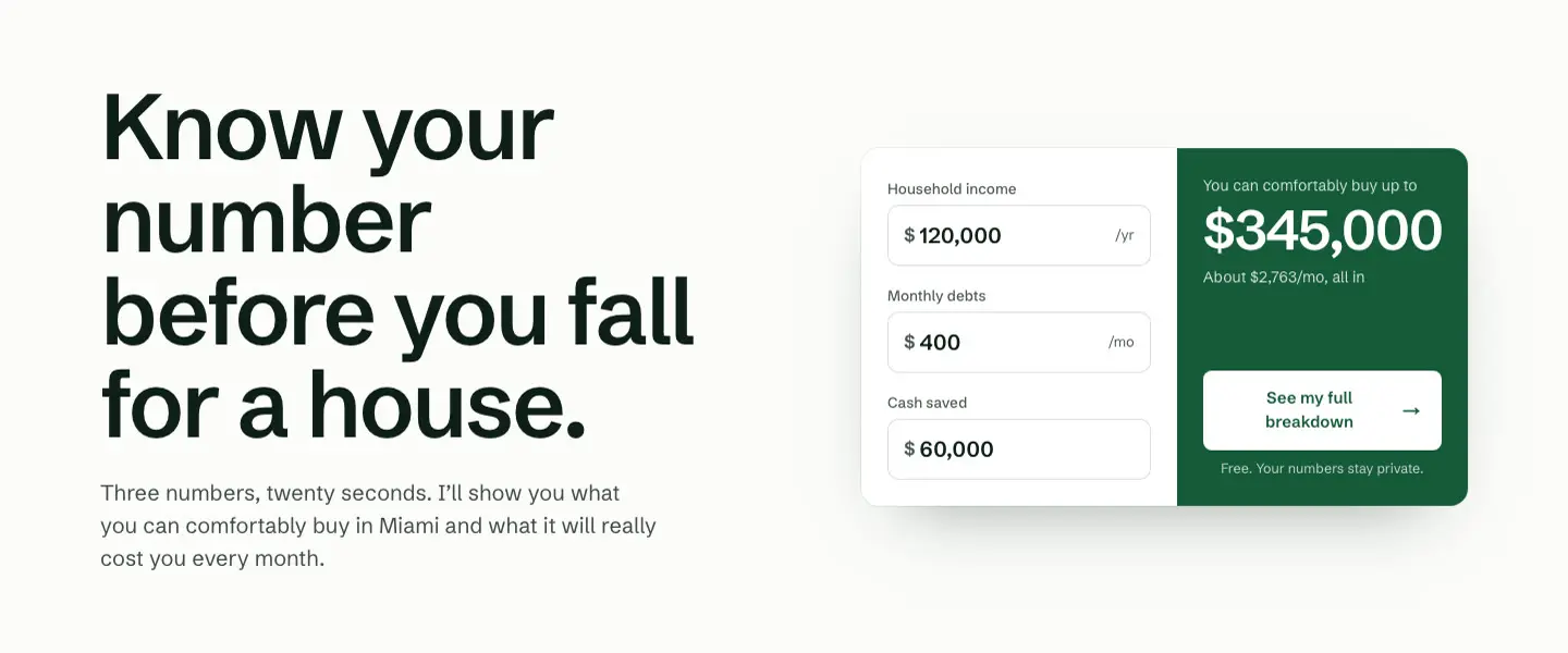
It opens on a realistic example, so you see a real price before you touch anything. Dragging feels like playing. One number is free. The full breakdown asks for a name and phone number, and that's the lead.
Details you won't notice
- It adds mortgage insurance when you put down less than 20%, which most first-time buyers pay.
- Home insurance grows with the price instead of staying flat.
- Tap any number to type an exact amount.
- Ten automatic tests check the math.
Speak their language.
In Miami, many buyers would rather read in Spanish. So the whole site is in English and Spanish, not just a button or two.
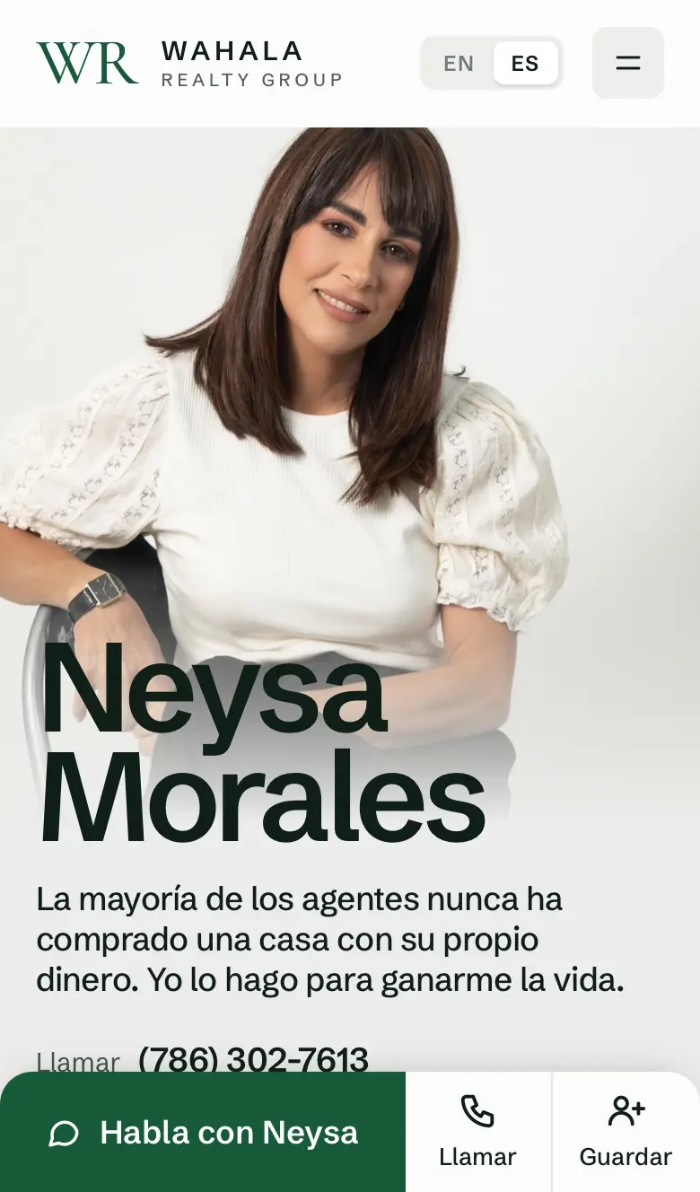
- Written, not machine-translatedEvery new line was written in both languages at the same time.
- Fits in bothSpanish words are longer. "Guardar" was getting cut off, so each language's bar is sized to fit.
- Easy to switchEN and ES sit at the top of every page.
Make Google understand it.
A site can look great and still be hard for Google to read. Google reads the page's title, its description and its main heading, so those have to say who she is and what she does.
Before
wahala realty
Wahala Realty | Neysa Morales Gonzalez PA — Miami & All of Florida Real Estate
Wahala Realty — Neysa Morales Gonzalez PA. Real estate agent, broker & investor based in Miami, serving all of Florida. Venta, compra y renta de propiedades.
Main headingWAHALA
After
wahalarealty.com
Neysa Morales | Miami Real Estate Broker & Investor | Wahala Realty Group
Neysa Morales Gonzalez is a licensed Miami broker who invests her own money in real estate. Buying or selling anywhere in Miami-Dade, from Coral Gables to Miami Beach…
Main headingNeysa Morales, Licensed broker & investor in Miami
- Her name firstPeople search for an agent by name. Now her name leads the title and the heading.
- What she does, where"Miami real estate broker" is what buyers type into Google.
- Two languages, told apartThe old description mixed English and Spanish in one line. Now each language has its own page, and Google is told which is which.
Nothing is there by accident.
Every part of the page has to answer one question: why is this here? If there's no good answer, it goes.
Things we cut
- Small labels above headings that nobody reads
- Decorative words floating in the background
- A "Reviews" label above "What clients say"
- A "6 reviews" count that made her look small
- Street View pictures of the sold homes
- Thin arrows that were hard to see
What's left
- Her faceSo you know who you'll work with.
- One sentenceSo you know why her.
- Tools that answer real questionsSo you have a reason to leave your name.
- ProofReal sales, real photos, real reviews.
- A way to reach her, everywhereSo you never have to look for it.
- Why it mattersThings thrown in for no reason make a site feel cheap, or made by AI without anyone checking.
- How it feelsWhen every part has a job, the whole site feels intentional. Visitors can feel that, even if they can't say why.
- The testPoint at anything on the page. We can tell you why it's there.
The new site, top to bottom.
Everything above, working together. On a computer and on a phone.
The whole new site, top to bottom, on a computer and a phone.
What changed for Neysa.
The old site was a brochure. The new one works for her, every day.