
How we built
Decor & Plants.
Every choice we made, and why.
decorandplants.comSimple, elegant, easy to use.
Decor & Plants is a luxury interior design studio. We built its website to feel like the rooms it designs: calm, high-end and simple. One page, in the order people need it, with one clear way to get in touch.
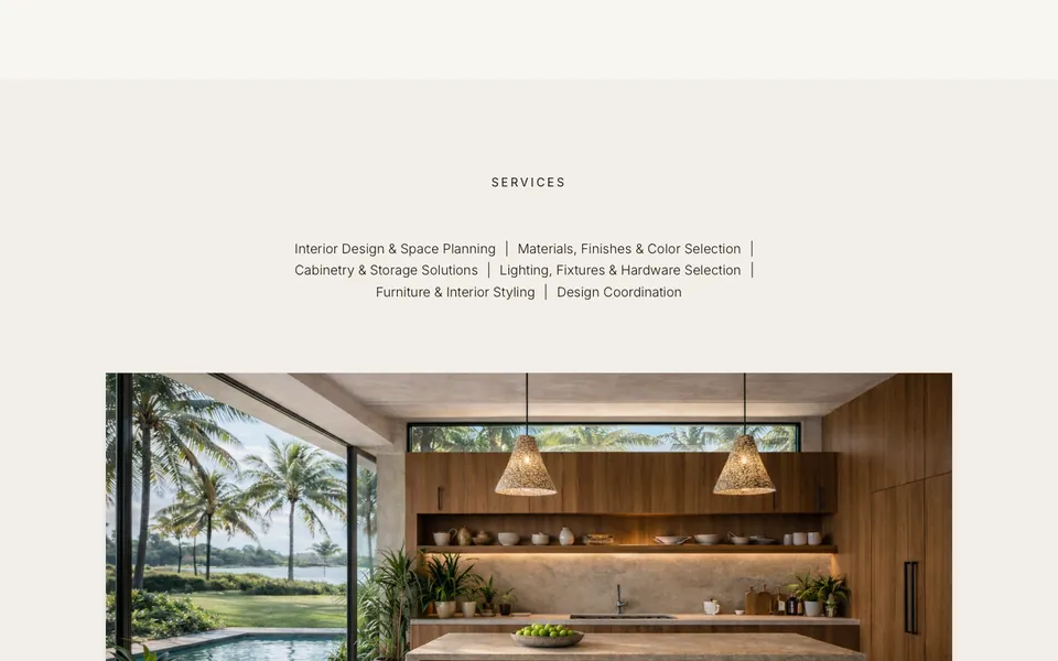
On a computer
On a phone
- Why it mattersPeople choose a designer by taste. The website is the first room they walk into.
- The jobShow the feeling of the work, say what the studio does, and make it easy to get in touch.
- The testOpen decorandplants.com on a phone. The first screen is the studio's line and one button.
A first screen that sets the tone.
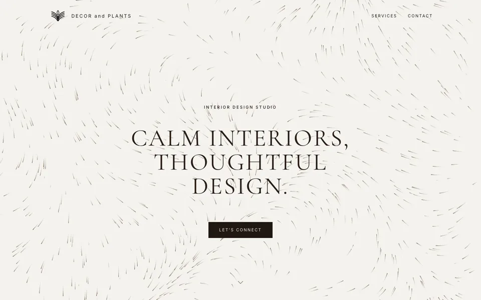
The first screen says three things: what the studio is, how its rooms feel, and how to start. Behind the words, a thousand thin lines drift slowly in warm browns.
The first screen
In the first screen
- One lineCalm interiors, thoughtful design. The whole promise in four words.
- One buttonLet's connect is the only thing to click. It glides down to the form.
- Drifting linesDrawn live by the browser. Still enough to read over, alive enough to notice.
- A quiet top barThe leaf logo, Services and Contact. Once you scroll, it frosts over the page and stays.
Made to match the brand.
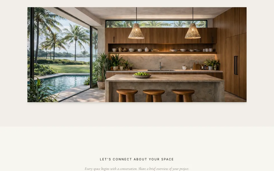
An interior studio sells a feeling. So the site works like one of its rooms: lots of space, soft colours, natural materials, and one thing at a time.
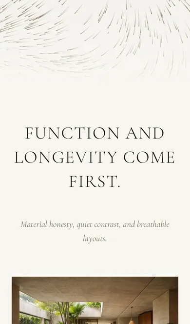
Scrolling on a phone
The look
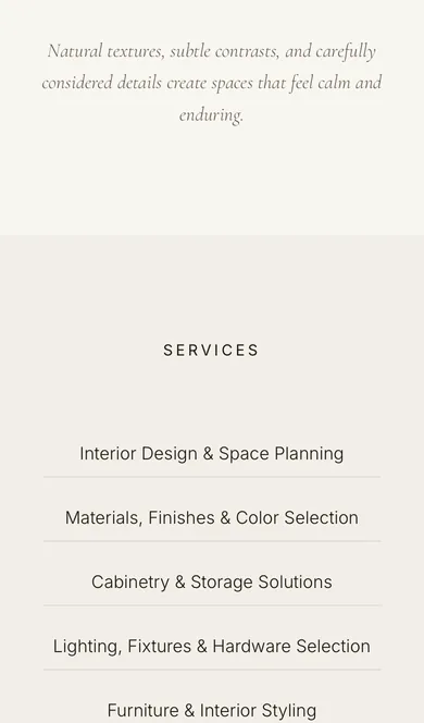
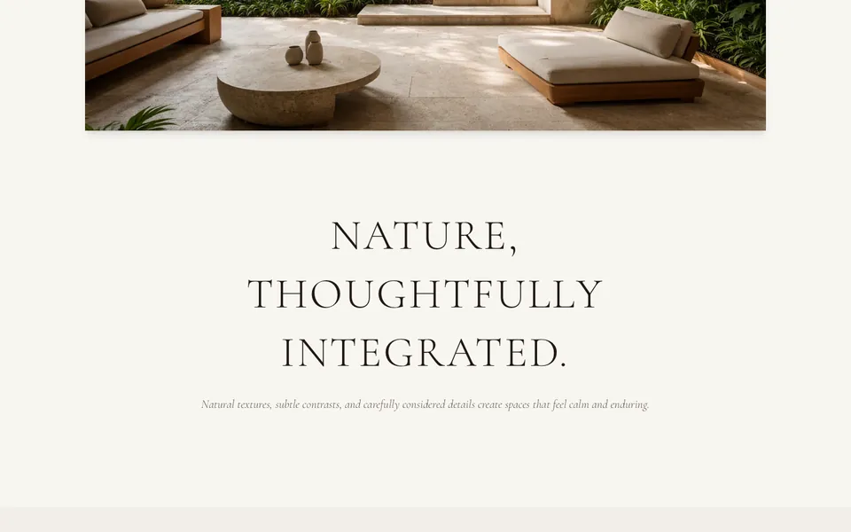
- Two typefacesCormorant Garamond, a light serif, in capitals for the headings. Inter for everything else.
- Warm, quiet coloursCream, soft stone and a deep brown. The green of the plants is saved for the footer.
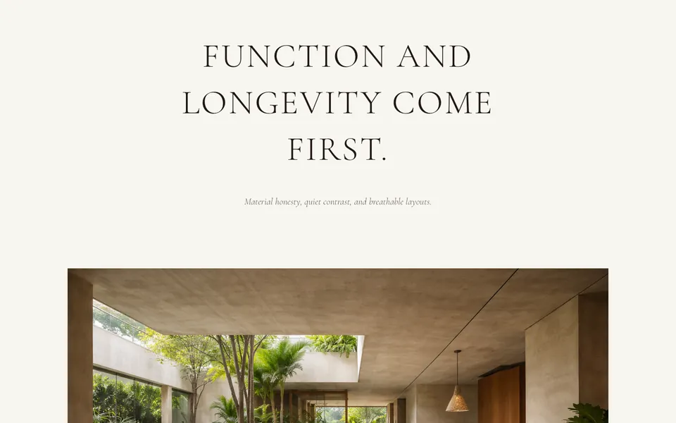
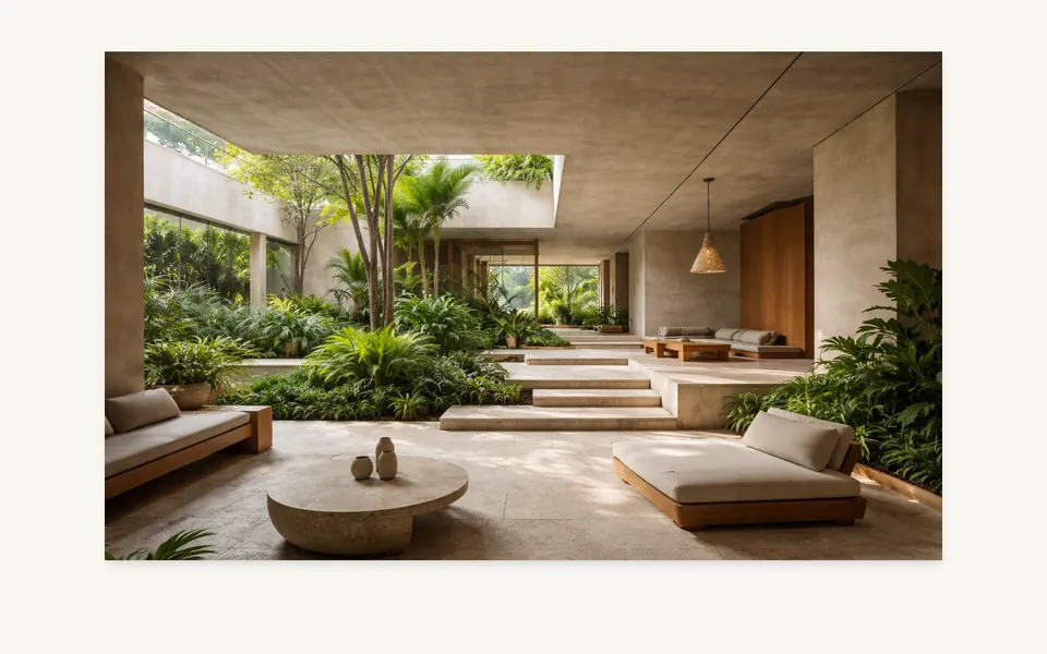
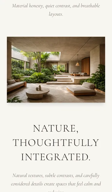
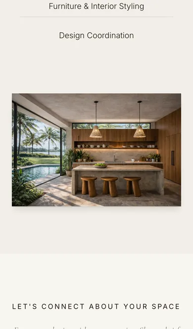
- Large photosEach room gets the full width, with a few words above it, never on top of it.
The feel
- SpaceMost of every screen is left empty on purpose.
- Slow motionWords and photos fade in gently as you scroll. Nothing flashes or spins.
- Few wordsShort lines in an italic serif, so nothing reads like a sales pitch.
Leaves that move in the footer.
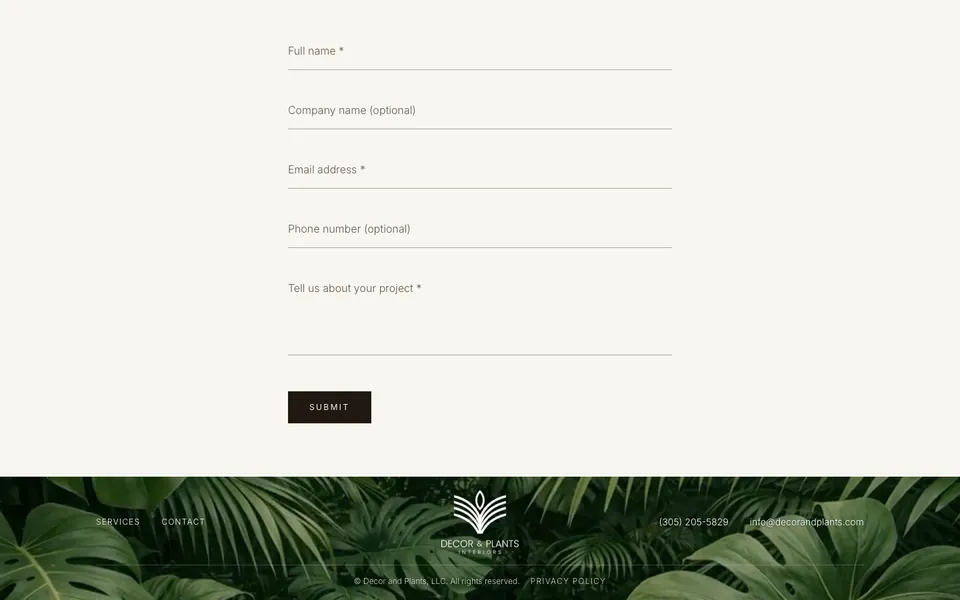
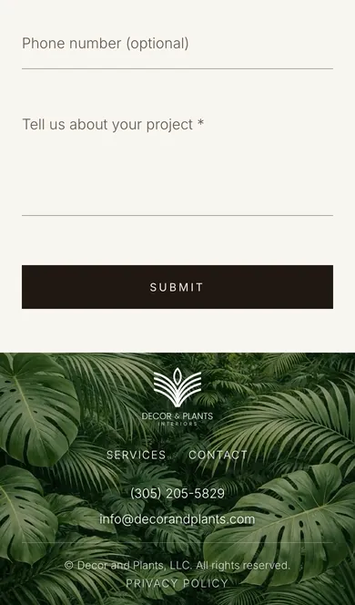
At the bottom of the page, the footer sits on tropical leaves that sway slowly, on a loop. It brings the plants in Decor & Plants to the last screen, right behind the phone number and email. A small touch that makes the whole site feel alive.
On a computer
On a phone
One clear way to get in touch.
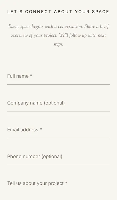
Every screen leads to the same place: a short form that goes straight to the studio. For people who would rather talk, the phone number and email sit in the footer, one tap away.
Send a message
Or call
What we built for Decor & Plants.
A site that looks like the studio's work, and gives people one easy way to reach it.