How we rebuilt
Anna Miller's.
Every choice we made, and why.
annamillersrestaurant.comUse the old site. Then watch the new one.
In screenshots, the old site looked fine. Using it was another story: no menu bar, words too small to read, and links that open new tabs. Try it. It's the real old site, saved by the Wayback Machine.
The old site. The real one. Click around.
Try View our menus, or About us. Count the tabs that open in your browser.
The new site, doing the same jobs.
The old site. The real one. Try it.
Try to find the lunch menu. Most links open a new tab, like they did on a phone.
The new site, doing the same jobs.
Turn pictures back into words.
Every page of the old site was one big image: the hours, the address, the menu, even the links. It looked fine on a computer. But a picture of words isn't words.
The old site
The new site
Before
- The homepage was one image, with clickable spots drawn on top
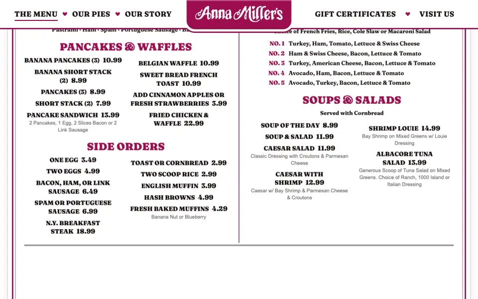
- The menus were photos of the printed menus
- Google couldn't read a single price or dish
- A screen reader found nothing to read out loud
- On a phone, you pinched and zoomed to read anything
After
- Real textEvery dish, every price, the hours and the address.
- Pictures for foodPhotos are used for plates and pies, not for words.
- Readable by GoogleSo "pie near Pearlridge" can find it.
- Readable by everyoneScreen readers, zoom, translation apps.
- Sized for the phoneNo pinching. The text fits the screen.
- Why it mattersMost people look up a restaurant on a phone, standing somewhere, in a hurry. They want the hours, the menu and the way there.
- What we keptThe look. The arch, the maiden, the hearts and the tulips are still there, drawn as artwork around real text.
- The testSelect any word on the new site. You can, because it's text.
Keep what people love.
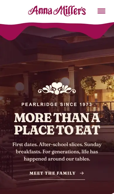
A place open since 1973 already has a look people know. A rebuild shouldn't throw that away. We kept it, and gave each piece one job.
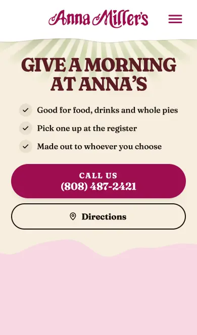
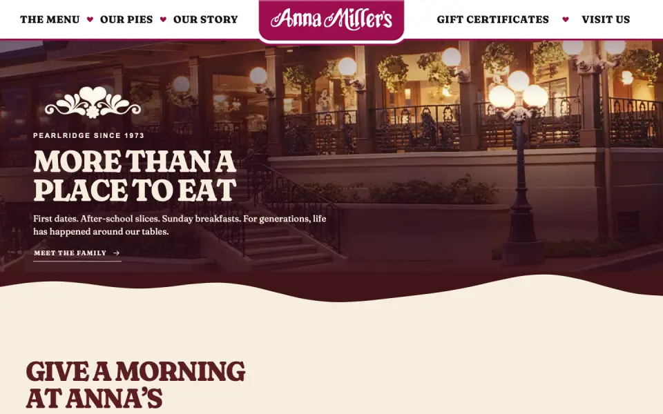
WhyThe restaurant itself, with its staff waving out front. Then four words and one button. The same sign, the same colours, easier to use.
Three colours, from the sign.
The old pages put hot pink text on magenta. We kept the family of colours and made them easy to read: a deep maroon, a warm cream, and white.
Kept
- The wordmarkTraced by hand, so it stays sharp at any size.
- The maiden, the hearts and the tulipsThe Pennsylvania Dutch art from the menus and the pie box.
- The archThe shape of the old menu cover.
- Maroon and creamThe colours of the sign and the uniforms.
Changed
- Bigger textLarge headings in a sturdy serif, plain body text under them.
- Dark on lightText sits on cream or white, never on a busy picture.
- Real photosThe building, the staff, the plates and the pies.
- One button per screenSee the menu, call, or get directions.
Make the menu readable on a phone.
The menu is the page people open most. On the old site it was a photo of the printed menu, so on a phone the words were tiny and the right side was cut off.
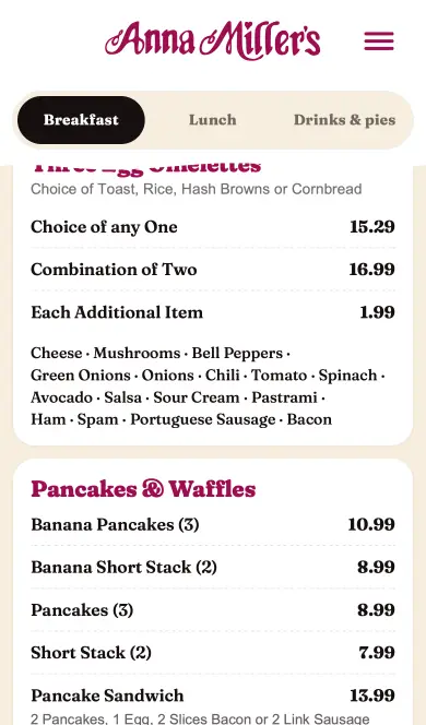
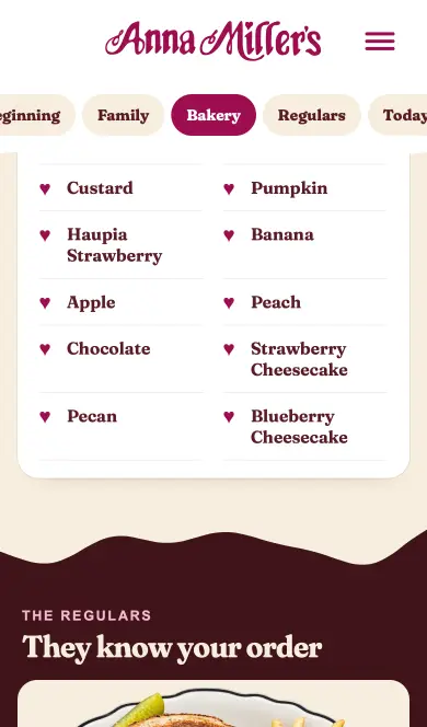
WhyThe same menu, written as text: big section names, each dish on its own line, every price lined up on the right. It runs from breakfast to the pie case on one page.
The old site
The new site
- Tabs on a phoneBreakfast, Lunch, and Drinks and pies. One tap, and you're in the part you want.
- Prices on the rightYour eye runs down one edge. You compare in a second.
- Names you can scanFruits & Juices, Two Ranch Eggs, Hamburgers. Big section names, so you find your part fast.
Show the food.
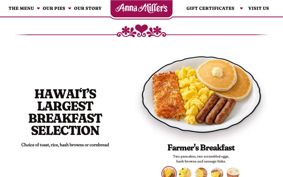
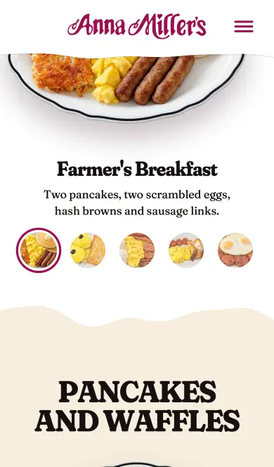
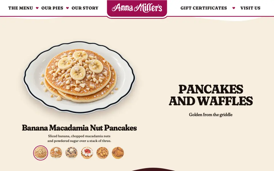
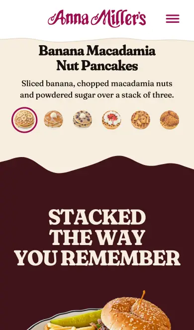
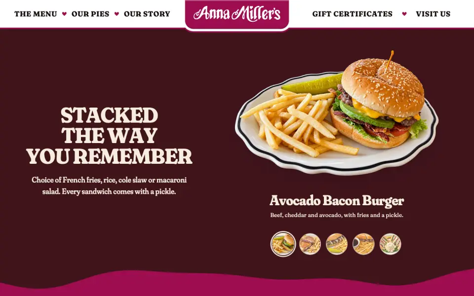
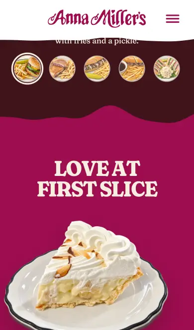
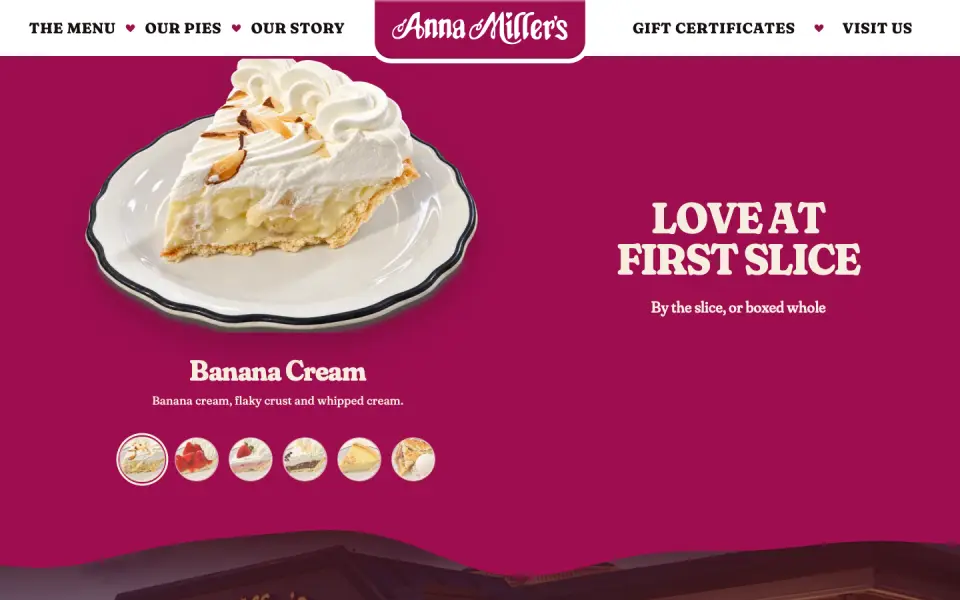
People choose a diner with their eyes. The old site had one collage of pies and a few small plates. The new one shows each dish and each pie on its own, on the restaurant's own plates.
Pick a dish
The pie case
0 pies in the new pie case, each with its own photo.
- Tap a dish, see itUnder each plate is a row of small photos. Tap one and the plate changes, with its name and what's on it.
- The pie caseEvery pie on the pies page has its own photo and name. Each comes by the slice or boxed whole, and the page says so.
- Same plate, every photoThe same plate and the same light in every photo, so the page feels like one menu, not a pile of pictures.
Say one thing about the hours.
The old site said three different things. The homepage picture said the dining room closes at 3 PM. The About page said open 24 hours a day, 365 days a year. The breakfast page was called "24 Hour Breakfast".
Before
- "Hawaii's popular 24-hour restaurant" in Google's description
- "Open 24 hrs a day, 365 days" on the About page
- "Monday to Friday 8:00 to 3:00" inside the homepage picture
After
- Monday to Friday, 8 AM to 3 PM
- Saturday and Sunday, 7 AM to 3 PM
- Bakery open until 5 PMThe same hours in the footer, on the visit page, and in the details Google reads.
- Wrong hours cost a visitSomeone who drives over at 9 PM because a website said 24 hours doesn't come back.
- The bakery gets its own lineIt stays open later than the dining room, so it's listed on its own.
- Told to GoogleThe hours, the address and the phone number are written in the format Google reads for its map listing.
Make it easy to get there.
A restaurant site has three jobs: show the food, say when it's open, and get you to the door. The old site sent you to an old MapQuest page, and "See our video" opened a Flash file, which browsers stopped playing in 2021.
The old site
The new site
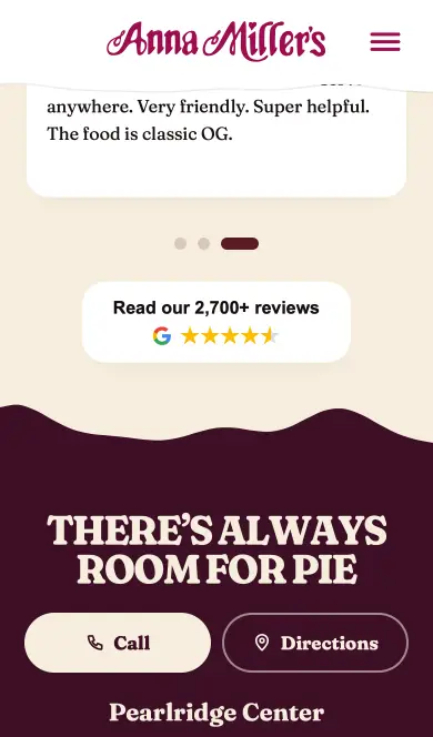
- Call, in one tapThe phone number is a button on every page. On a phone, it dials.
- Directions, in one tapOpens the maps app with the restaurant already in it.
- What first-timers askIt's a free-standing building at Pearlridge Center, parking is free, and there's wheelchair access.
Use what people already know.
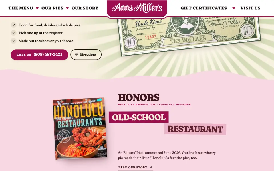
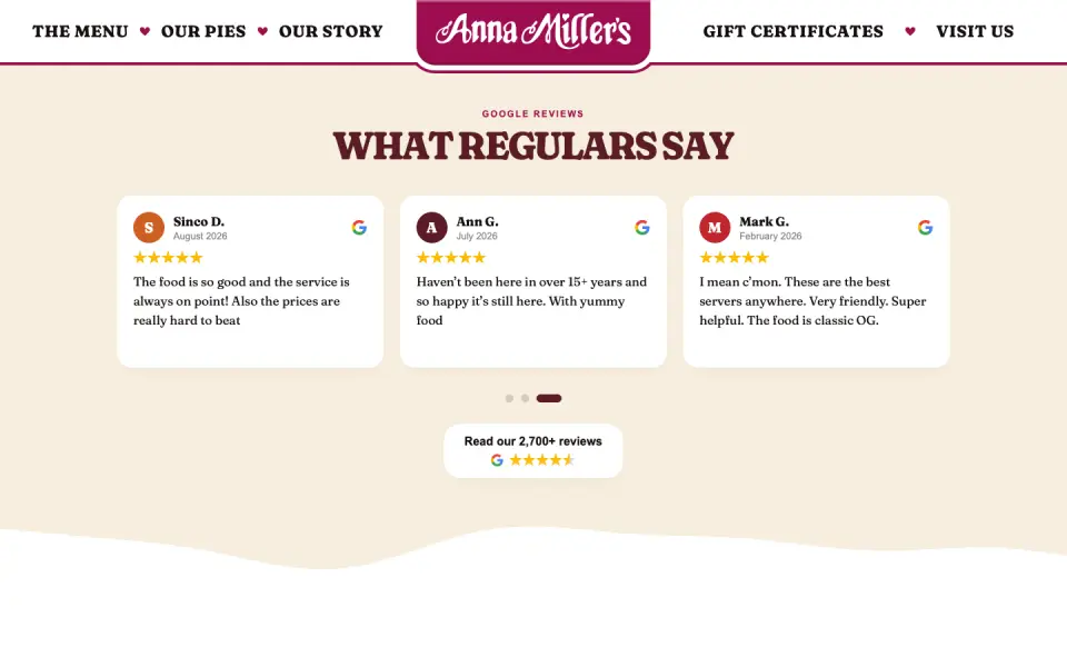
Anna Miller's has more than 2,700 reviews on Google. That's the proof. We show a few, the way Google does, so people recognise them on sight.
- Word for wordReal reviews, copied exactly, with each reviewer's real star rating.
- Proof you can checkEach card opens that exact review on Google Maps.
- A familiar buttonThe G, the stars and "Read our 2,700+ reviews". You know where it goes before you tap.
Tell the story.
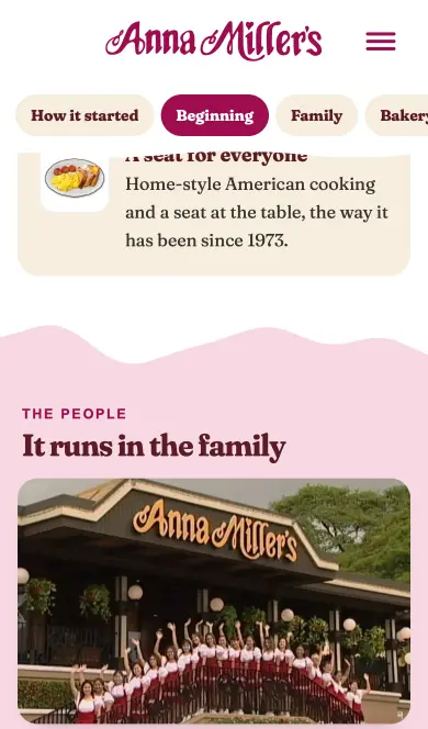
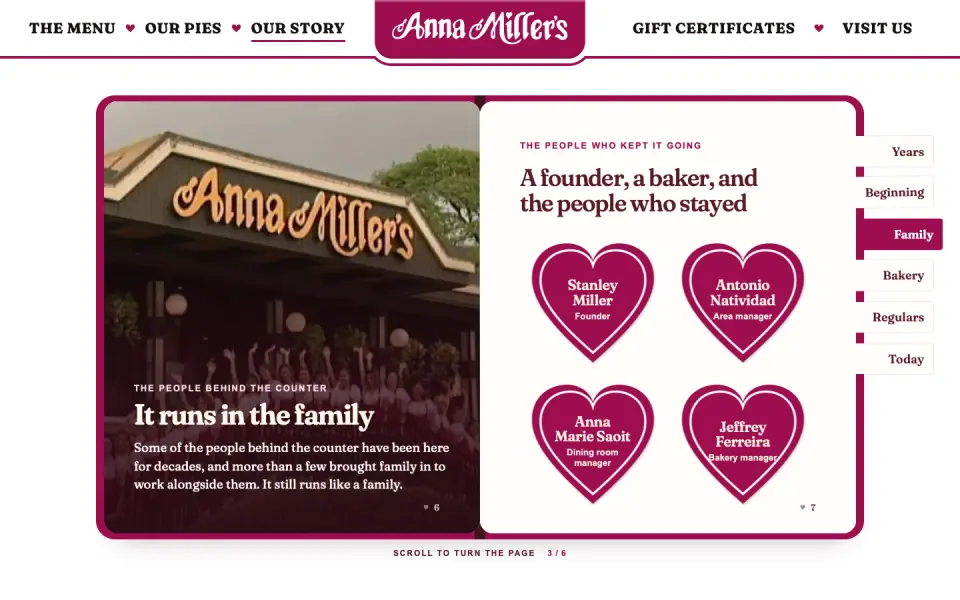
The old About page was one paragraph. The new story is a family album you turn by scrolling: fifty years of pie, coffee, and the people behind the counter, in six short chapters.
- People, not adjectivesThe founder, the area manager, the dining room manager and the bakery manager, by name.
- Recognition, with a sourceHonolulu Magazine's Hale ‘Aina Awards named it an Editors' Pick in 2026. The homepage says so, with the magazine cover.
- Only what we can proveWe checked the dates and claims, and fixed the ones we couldn't back up.
Make Google understand it.
Google reads a page's title, its description and its main heading. On the old site, two of those were thin and one was missing.
Before
annamillersrestaurant.com
Anna Miller's Restaurant
Hawaii's popular 24-hour restaurant --- always open to serve you.
Main headingNone. The words were in a picture.
After
annamillersrestaurant.com
Anna Miller's Restaurant & Pies | Pearlridge, Hawai‘i
Enjoy Hawai‘i’s largest breakfast selection. A familiar table at Pearlridge since 1973, with the diner favorites and famous pies of a Hawai‘i institution.
Main headingAnna Miller’s
- A page per searchBreakfast, lunch, pies and directions each have their own page, written for what people type.
- Old links still workpies.html, breakfast.html and sandwiches.html now open the new pages, so old bookmarks and Google results don't break.
- Facts in Google's formatThe address, hours and phone are marked up the way Google reads restaurants.
Nothing is there by accident.
Every part of the page has to answer one question: why is this here? If there's no good answer, it goes.
Things we cut
- A "See our video" link to a Flash file
- Directions on an old MapQuest page
- "24 hour" claims the restaurant no longer makes
- Menus as images of the printed menu
- Hit counter code on every page
What's left
- The foodReal plates and real pies.
- The menuAs text, with prices.
- When and whereOne set of hours, one tap to call or get directions.
- Proof2,700+ Google reviews and an Editors' Pick.
- The storyFifty years, told with the people who lived it.
What changed for Anna Miller's.
The old site was a set of pictures. The new one answers what people want to know before they come in, on any screen, in a way Google can read.