How we built
Anisleidy Hernandez.
Every mockup, every pick, and why.
loansbyani.comA mortgage site built around one person.
Anisleidy Hernandez is a licensed mortgage loan officer in Miami-Dade and the Keys, in English and Spanish. We built her site so people meet her first, see their own numbers, and reach her in one tap. This is the design story: the mockups we put side by side, the ones we picked, and the small changes that came after.
- Why it mattersA mortgage is a big decision. People want to know who they are talking to before they share a single number.
- The jobPut her face first, answer the money question in seconds, and make calling, texting or WhatsApp one tap away.
- How we workedEvery big choice started as two to four real mockups. The site went through 36 saved versions, each checked on a phone and a computer.
The whole site, top to bottom.
Before the details, here is every section in order, on a phone and on a computer, from her first screen to the last word.
Built for people who tap an ad.
Most visitors arrive from a Google ad, on a phone, with a few seconds to decide. So every screen is high contrast and easy to read, with one clear thing to do. It is plain on purpose, but never boring: the moving first screen and the balcony photo give the page a life of its own.
What an ad visitor needs.
- 1Black words on white, big type, and short lines. Nothing to squint at, even in the sun.
- 2One action on every screen, always the same words: Get my rate.
- 3Proof she is a real person in the first second: her face, her name and her license number.
A sky made of words.
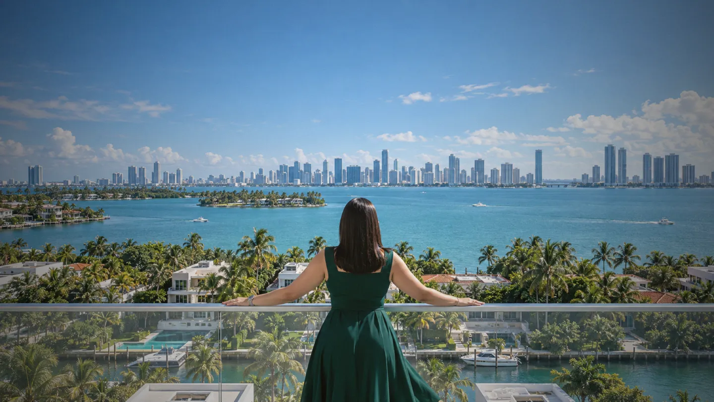
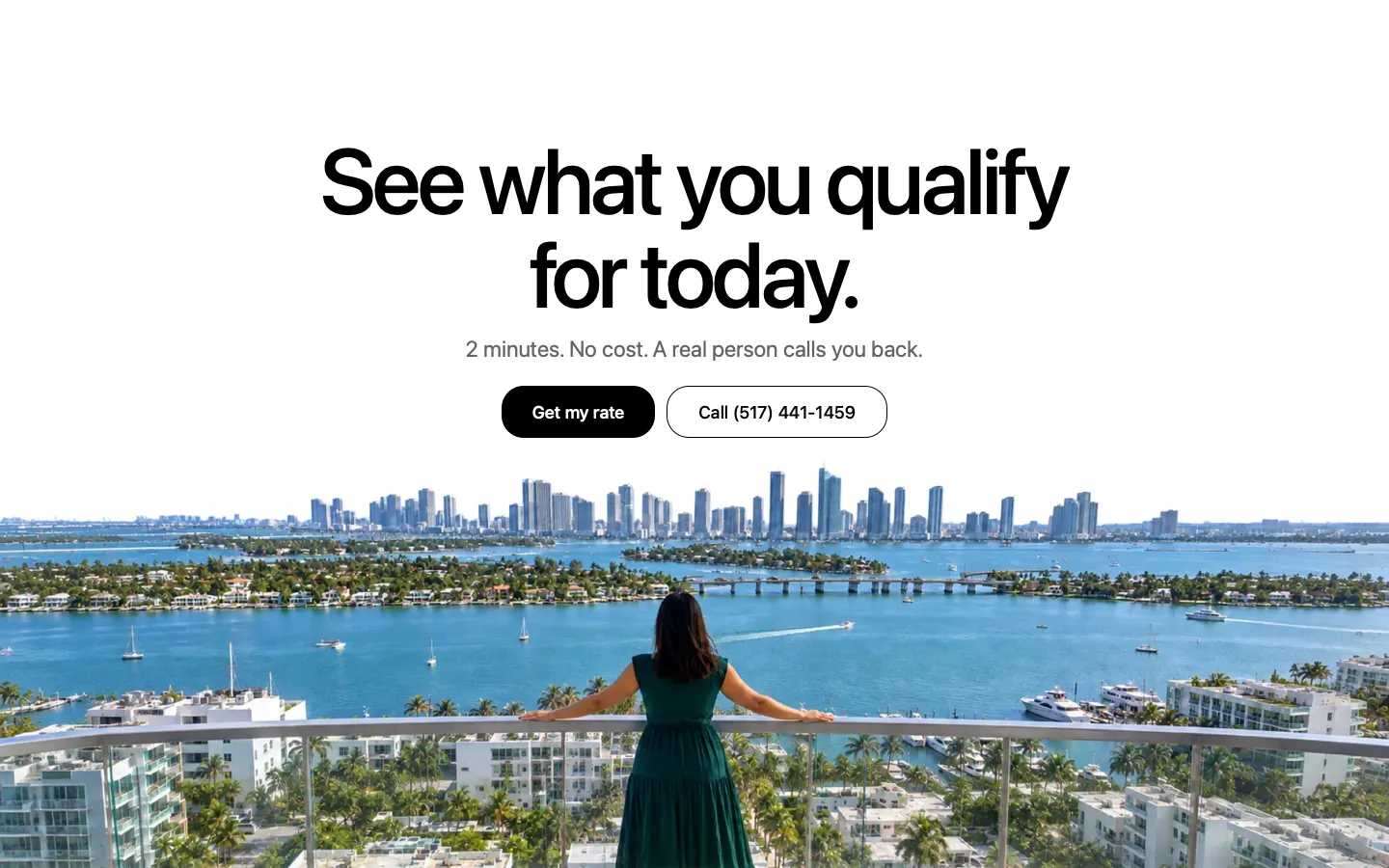
For the last screen before the footer, we cut the sky out of her balcony photo. The skyline and the palms stand against plain white, and the closing line sits right where the sky used to be. It is the one image on the page people stop on.
 12
Why it works.
- 1White behind the words keeps them as easy to read as the rest of the page, while the city still frames them.
- 2It shows her in her city one last time, right where people decide to ask for a rate.
- 3The photo fades straight into the footer, so the page ends without a hard edge.
Where it started.
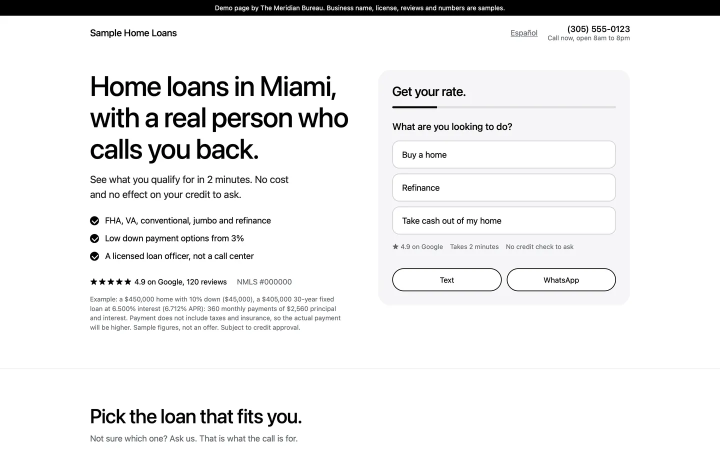
The first draft was our mortgage page template: a headline, a short form and sample numbers. It worked, but it could have been anyone. Every round after that made it more hers.
A first screen that asks the first question.
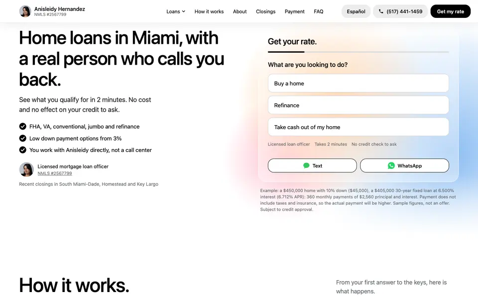
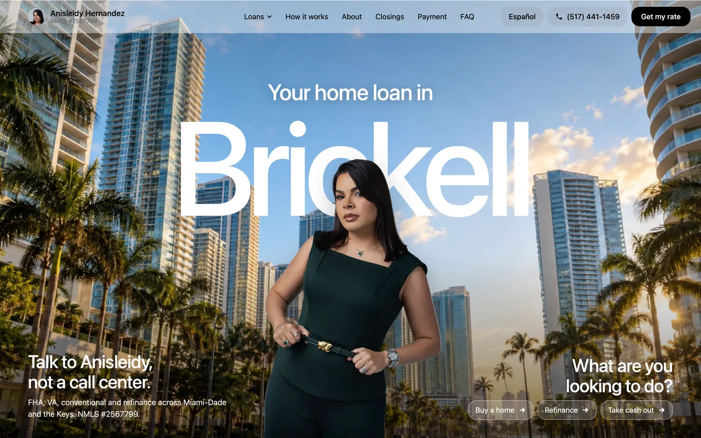
The first desktop version had a headline, a small line, two buttons and a box of questions, all around her photo. Too much on both sides. We tried three calmer layouts.
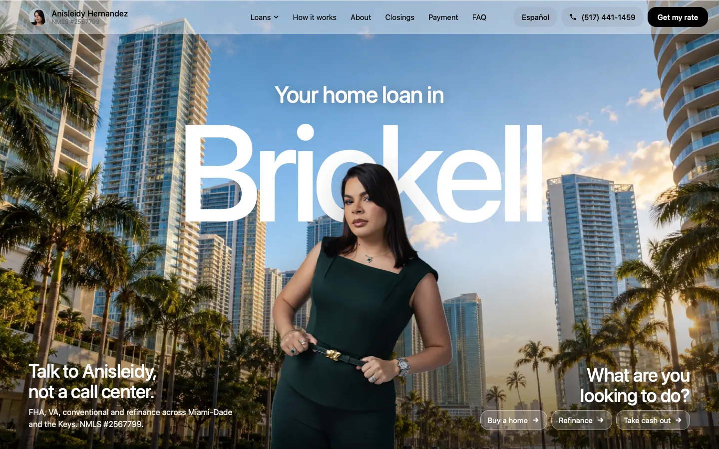
Why C works best on a mortgage page.
- 1Tapping Buy a home is an easier first step than Get my rate. People pick their own situation instead of signing up for a form.
- 2The tap opens the form already on question two, so they start one answer in.
- 3The three choices also say, at a glance, which loans she handles. Get my rate stays in the top bar for anyone ready now.
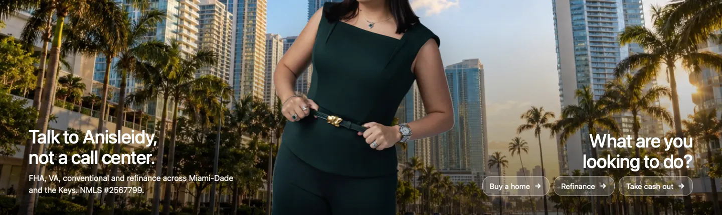
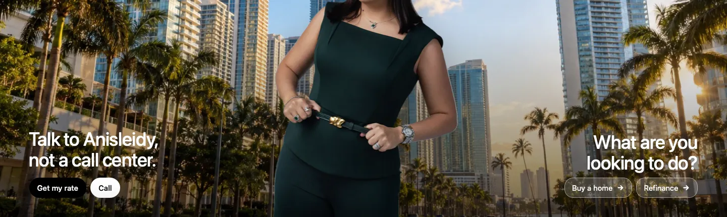
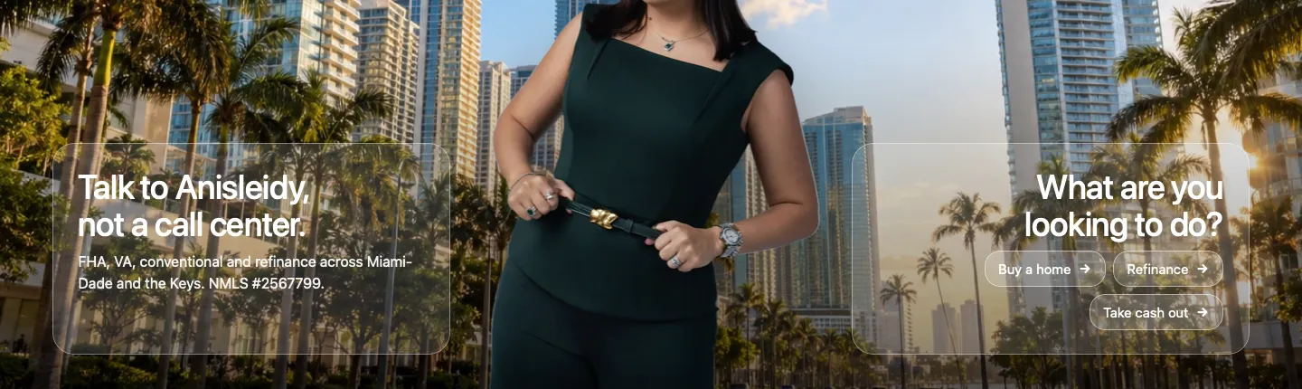
Then, balancing the two sides.
With C in place, her line and the question were both right, but they did not feel even. Three more mockups.
 123
Why D works best.
- 1Both sides are the same shape: a two-line heading, then one line under it. Your eye reads them as a pair.
- 2All three answers fit on one short row, so nothing hangs below and nothing is dropped.
- 3The bottoms line up on one line, so the screen feels settled. E lost an answer to look even, and F covered the photo with boxes.
The phone hero, round by round.
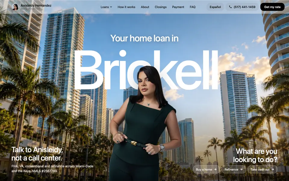
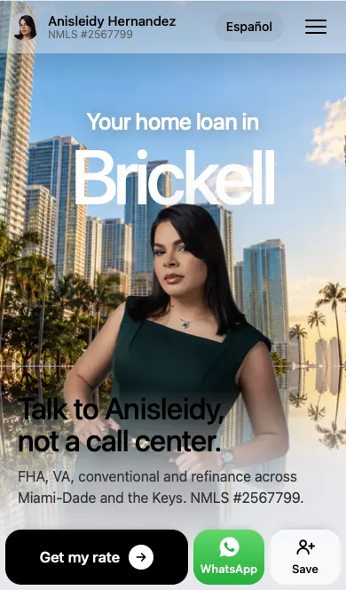
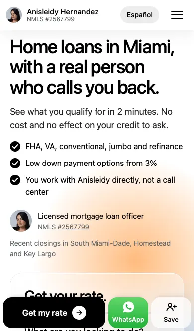
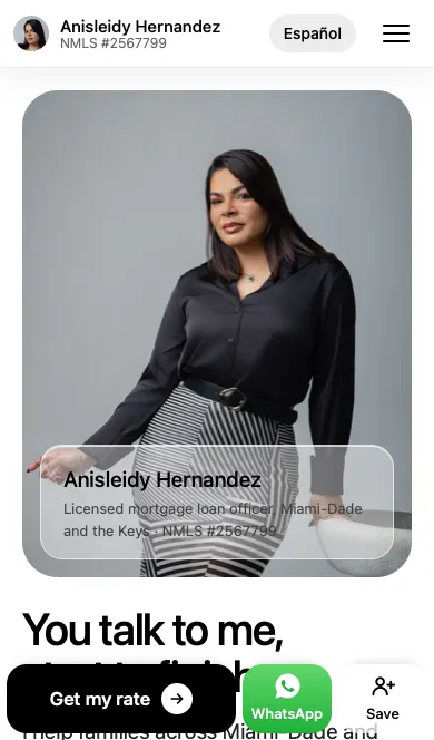
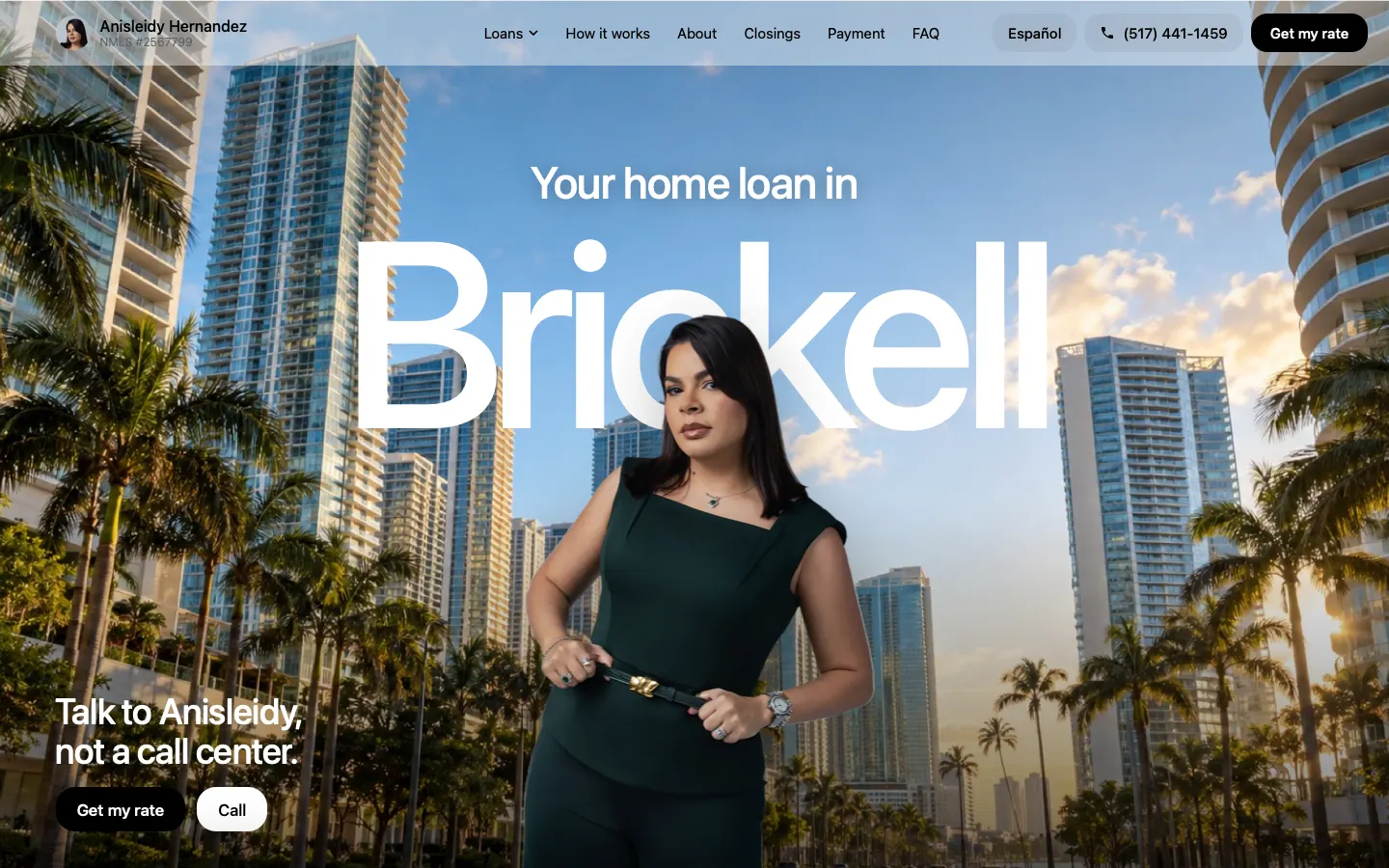
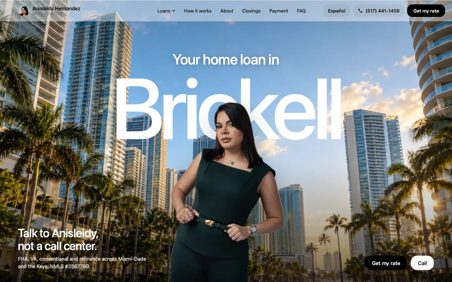
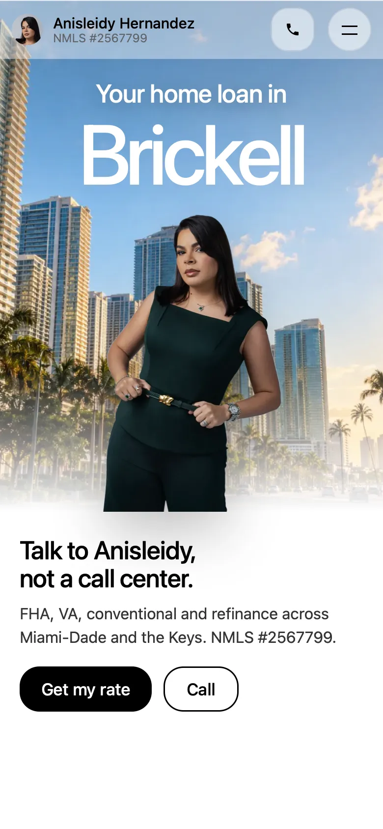
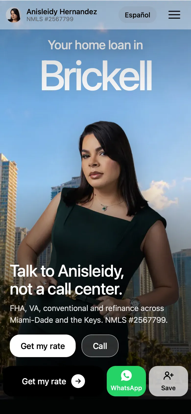
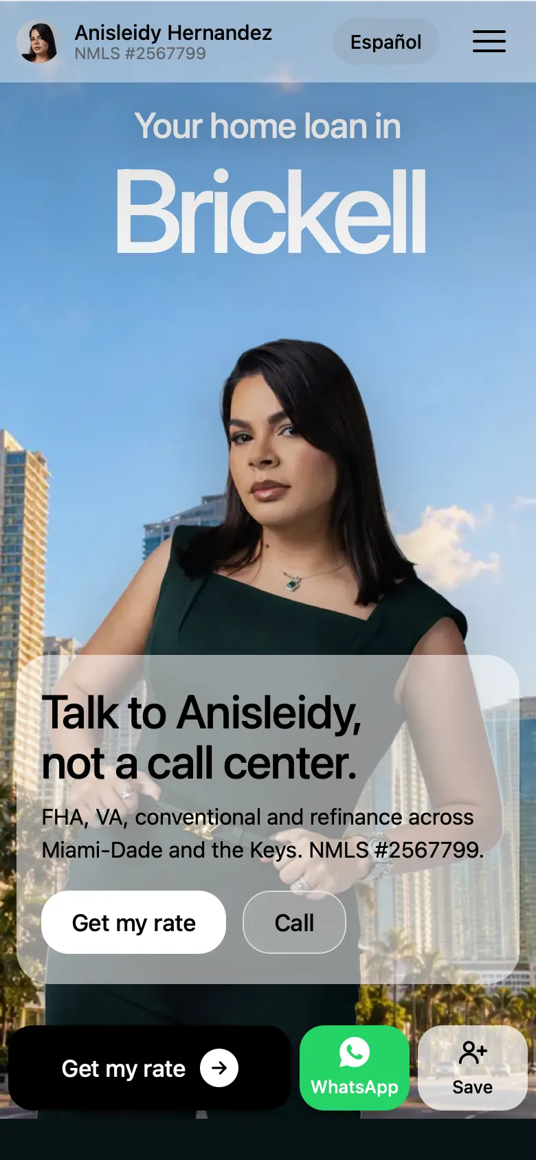
On a phone the first screen has one job: show her, show where she works, and get out of the way. The first version had her small and cut off at the bottom, with a block of text under her. We made three mockups. One, her stepping out of a photo card, was dropped early because her cut-out ran into the words. Here are the other two.
Why A won.
- 1It is the boldest first screen, and she is about twice as big, so real person, not a call center reads from the photo itself.
- 2Nothing sits on top of her. The words sit on the photo where it is quiet, over a soft fade.
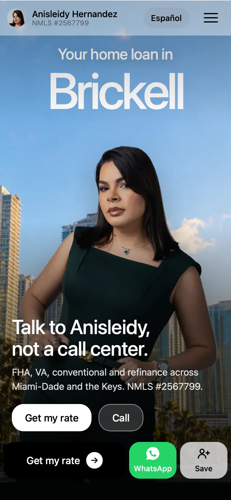
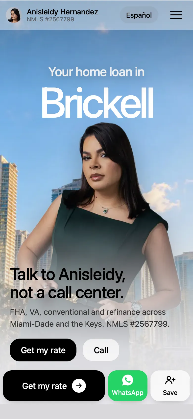
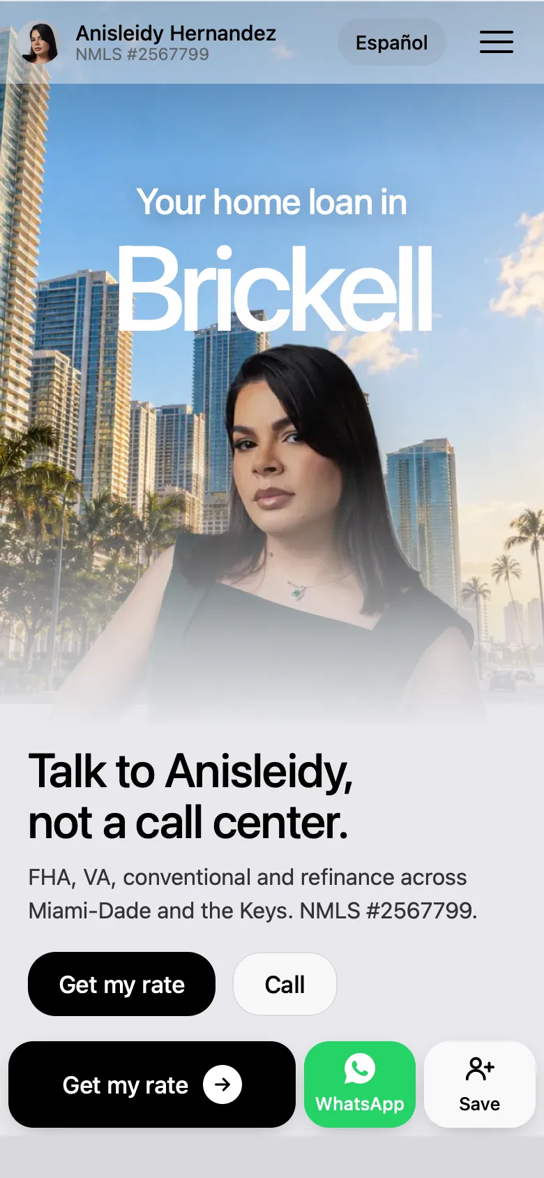
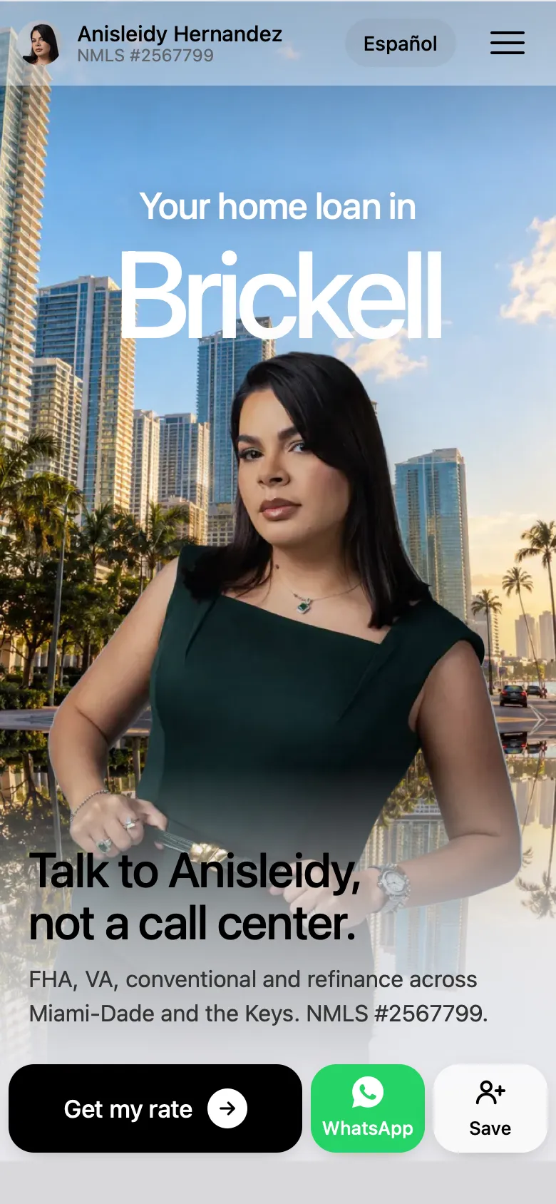
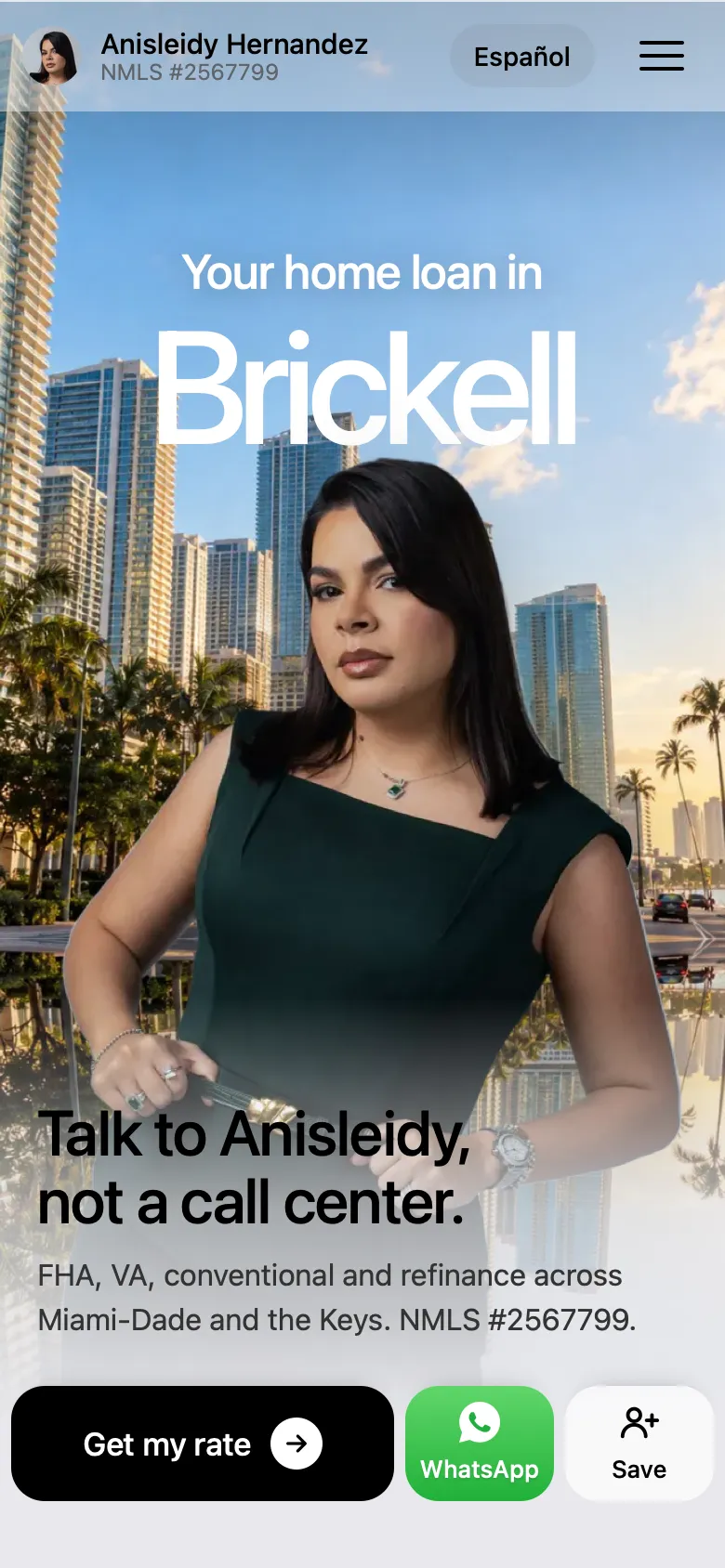
Then, five rounds of tuning.
 123
Why the final round works.
- 1The place name sits right above her head, so the first thing you read is your own neighbourhood.
- 2Her line sits low, where the photo is quiet, so she stays the biggest thing on the screen, not covered by text.
- 3One set of buttons, in the bar at the bottom. Earlier rounds had the same buttons twice.
Five places, one line that stays still.
- Brickell, Coral Gables, Miami Beach, Homestead, Key LargoEach place has its own photo behind her, and changes every 3.4 seconds on its own.
- Nothing jumpsLong names like Coral Gables shrink to fit, so the line above used to move. Now it is locked in place.
- No glitchesEvery photo loads before it shows, so none pops in half drawn on a phone.
A phone menu you can use with one thumb.
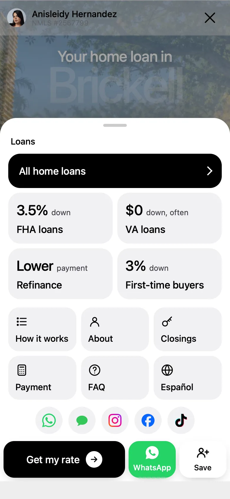
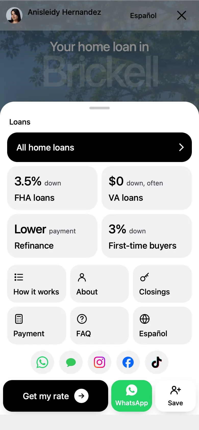
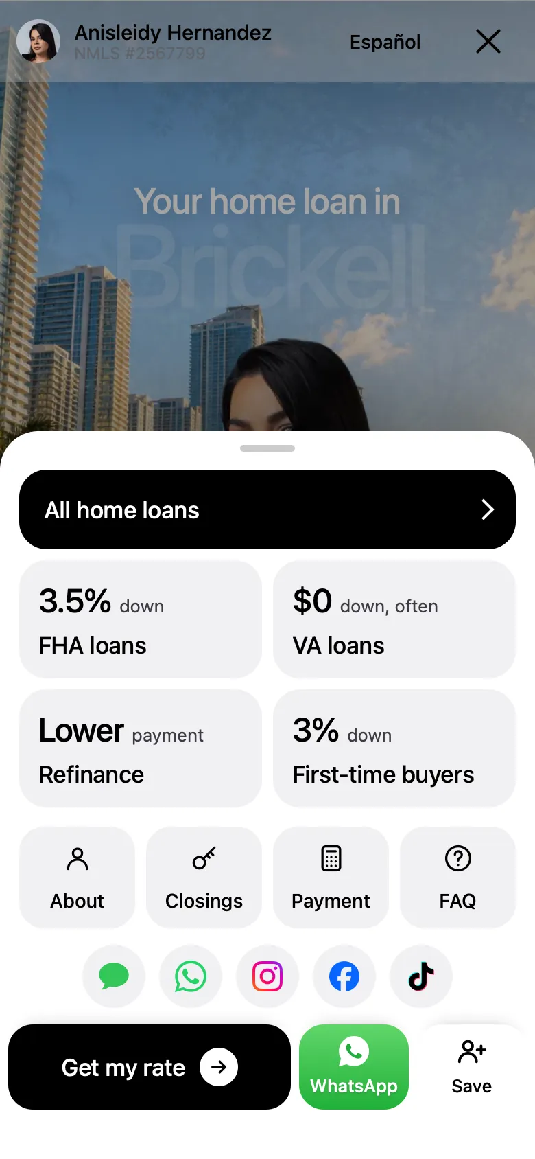
The first menu was a plain list that dropped from the top. We mocked up three new ones, then mixed two of them.
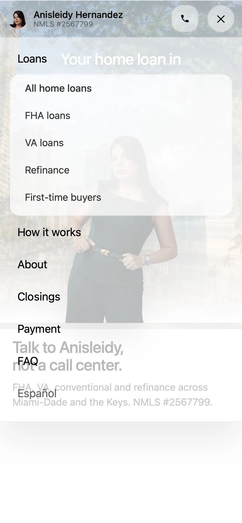
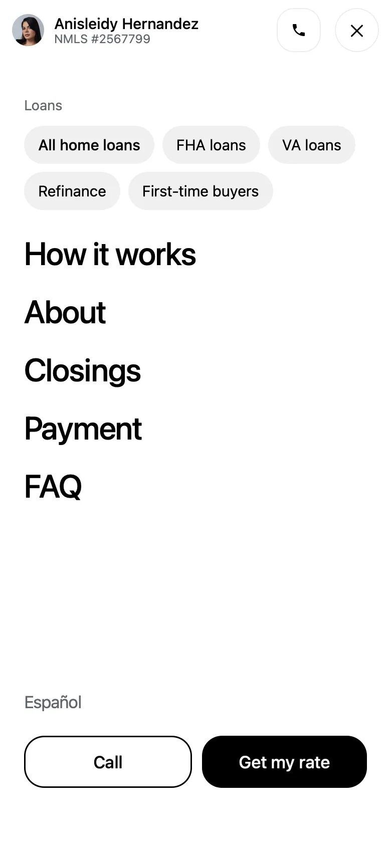
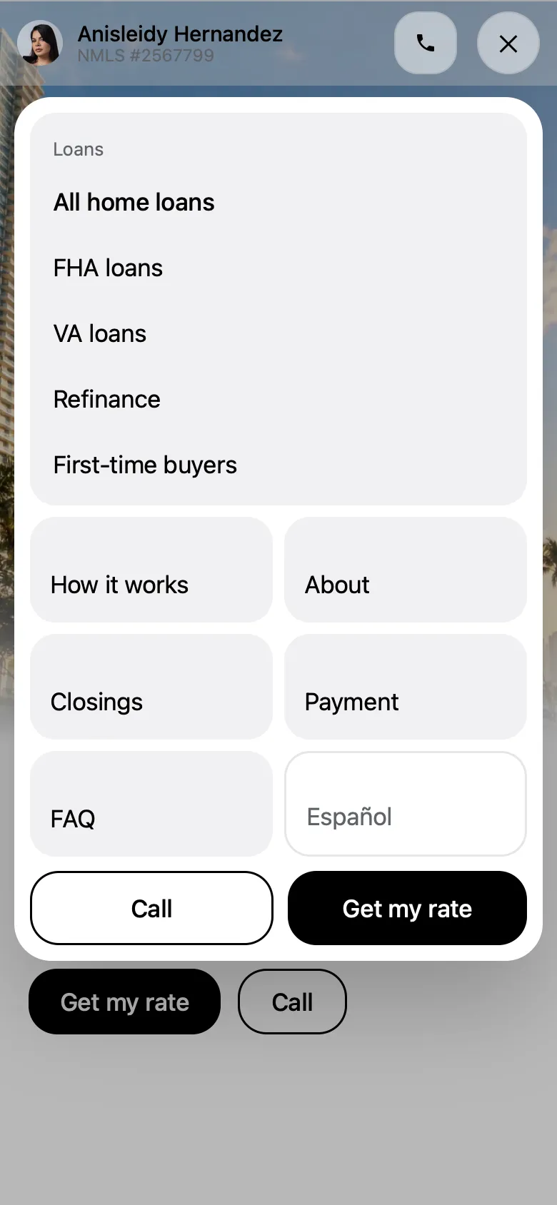
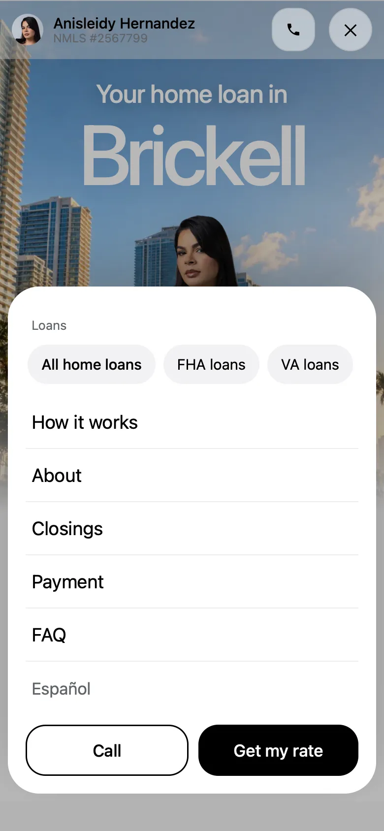
Why C, with B’s tiles.
- 1It slides up from the bottom, where the thumb already is. A dropped from the top, out of reach on a tall phone.
- 2B’s big grey tiles are easier to hit than a list of words, so the loans moved into tiles.
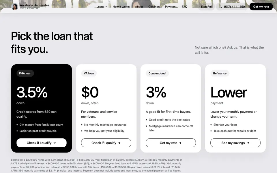
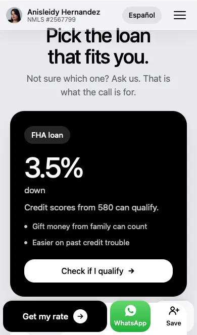
- 3Each tile shows what matters about that loan, like 3.5% down, so people can choose before they tap.
 1234
What the final menu fixes.
- 1No Loans label and no scrolling: everything fits on one screen, even on a small iPhone.
- 2Black text on solid white, so every word is easy to read over the photo behind.
- 3Four sections in one row and her socials under them, all above the bar.
- 4The sheet sits flat on the bottom bar, so the menu and the bar read as one piece.
Open, look, tap.
- Slides up from behind the barThe tiles come in one after another, and the page behind dims.
- Everything on one screenFive loan pages, four sections and her socials, even on a small iPhone.
- One tap to anywhereTap a tile and the page glides there. Tap the dim page to close.
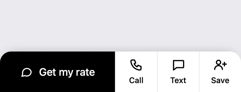
The bar at the bottom, in six rounds.
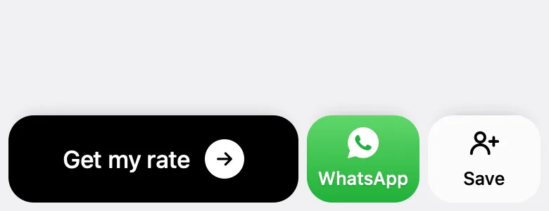
On a phone, the bar at the bottom is where people act. It went from four small buttons to three clear tiles that are always on screen. Three is the right number: one main action that is hard to miss, and two quick ways to reach her.
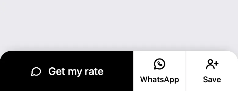
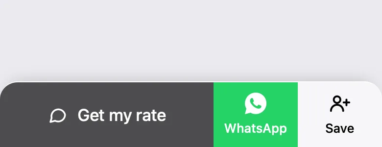
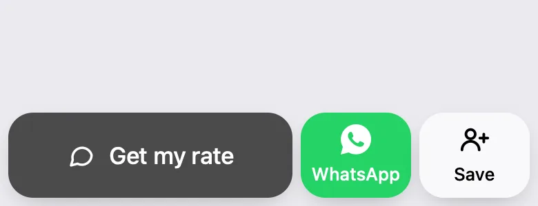
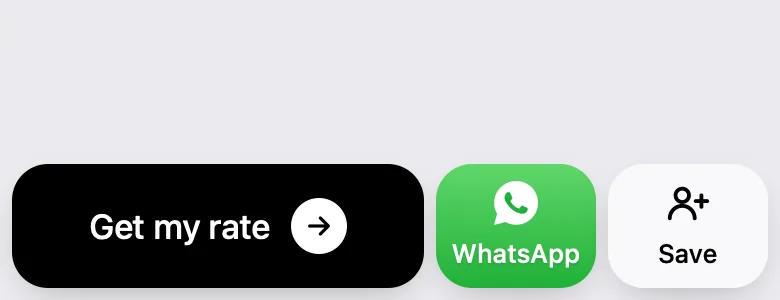
 123
Numbers that feel alive.
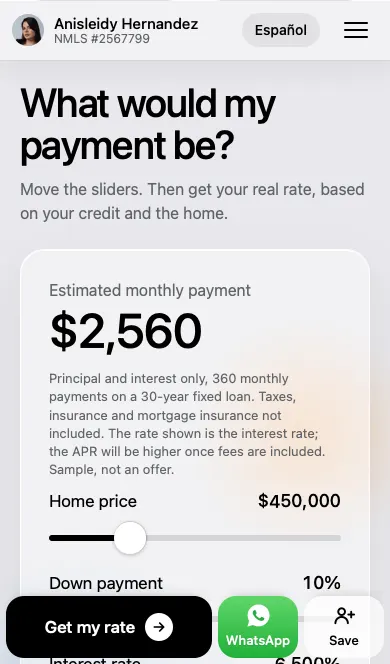
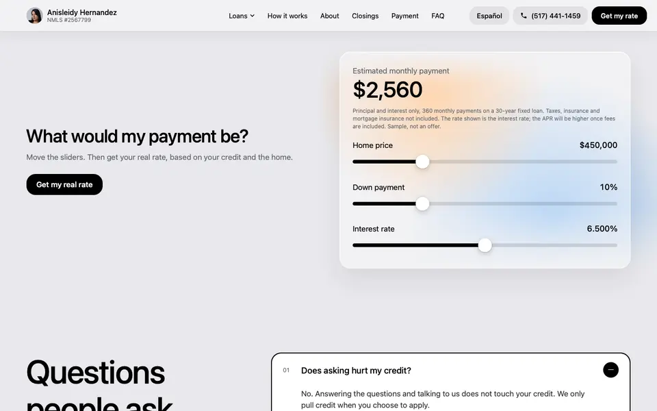
The payment calculator is where people stop and play. The first version worked, but the numbers just flickered and the sliders were hard to grab.
Every digit rolls.
- Rolling numbersEach digit slides to its new value like an odometer. Only the digits that change move.
- A knob you can findA thick black track and a large white knob that grows a little while you hold it.
- Thumb sizedThe touch area is 44px tall, and the labels went up to 17px.
How it works, played out.
- Three steps that run on their ownAnswer the questions, take her call, close. It loops left to right, with a different path each time.
- Real phone screensA call screen with call and hang up buttons drawn like an iPhone's.
- Less is moreA 1, 2, 3 progress bar was tried and taken out: the steps already show where you are.
Why it moves.
- 1Steps that sit still read as a list, and people skip lists. A flow that plays left to right shows the process in the order a borrower lives it.
- 2Step two is her calling you, on an iPhone call screen. It shows the promise, you deal with her start to finish, instead of saying it.
- 3It takes a different path each loop, so a second look still shows something new. On a phone it rotates on its own and pauses while you touch it.
A footer that ends the page.
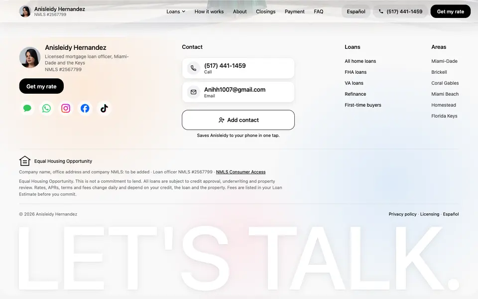
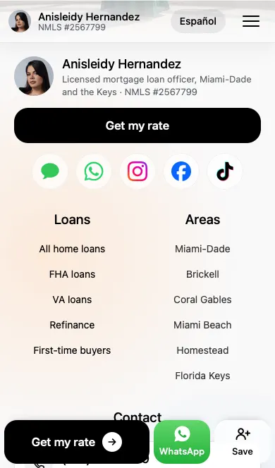
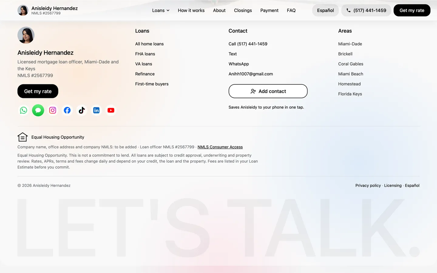
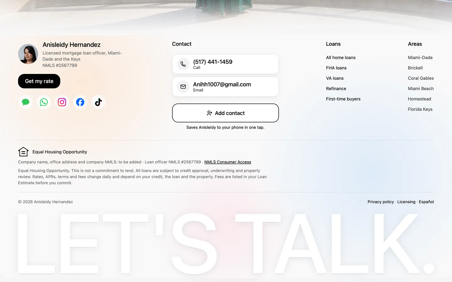
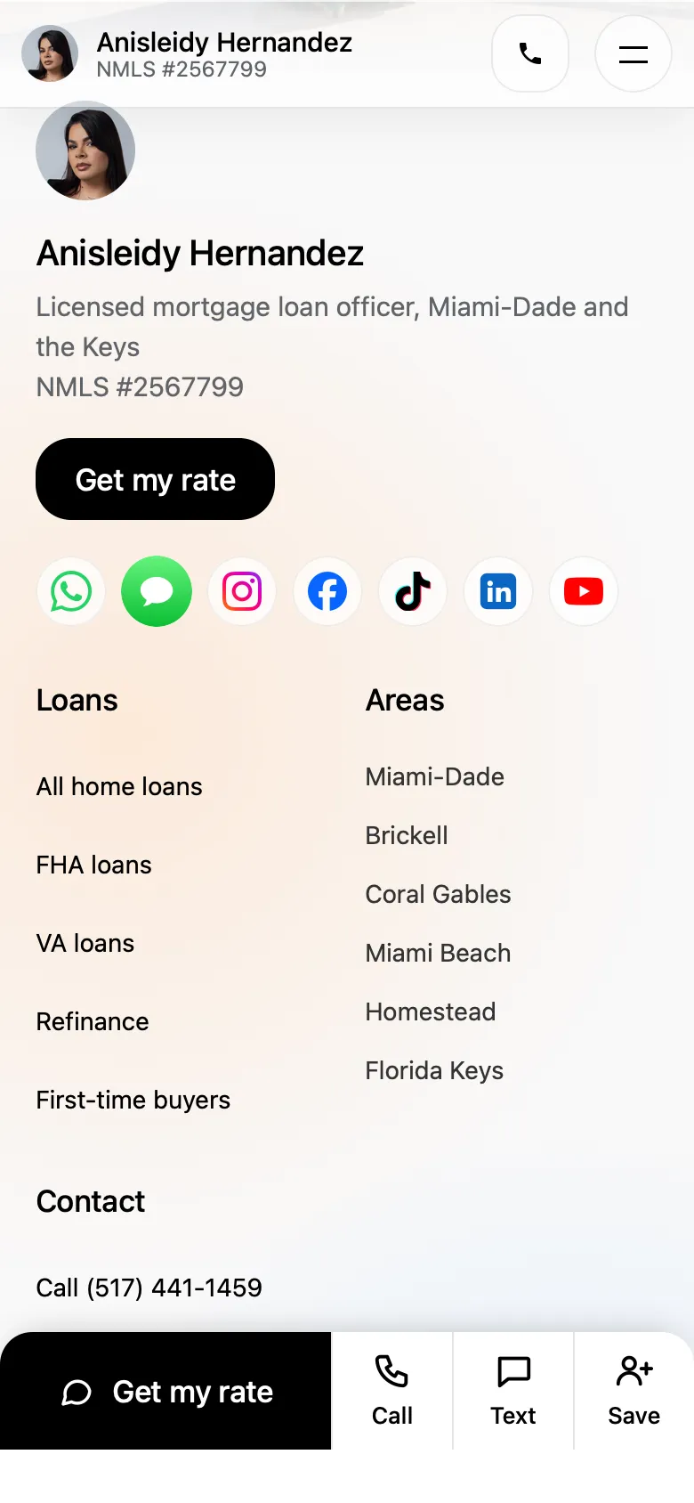
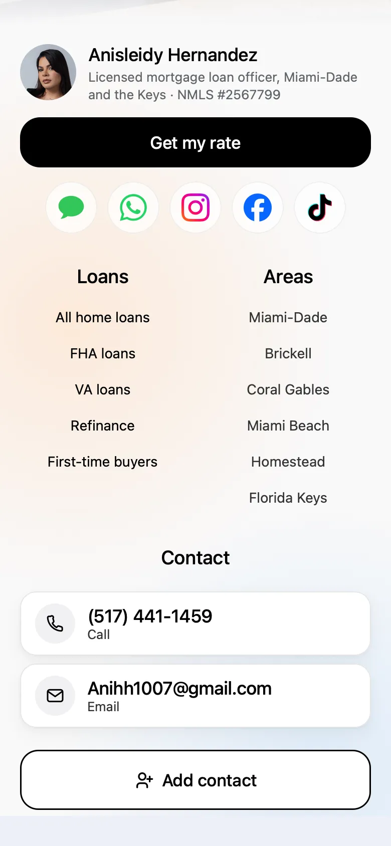
The footer started as four columns of small links. It became one glass panel with her face, her number written out, an Add contact button, and a big sign-off.
 123
 123
What makes the new footer better.
- 1Her photo sits next to her name and license, so the page ends the way it started: with her.
- 2Her phone number and email are written out in their own tiles, and Add contact saves her card in one tap.
- 3LET'S TALK. fills the row with the same gap on both sides, a clear last word. On a phone the icons and contact tiles are centred, each in its own box.
The details you feel.
Most of the work is small. Nobody notices each change on its own, but together they are why the site feels calm and easy.
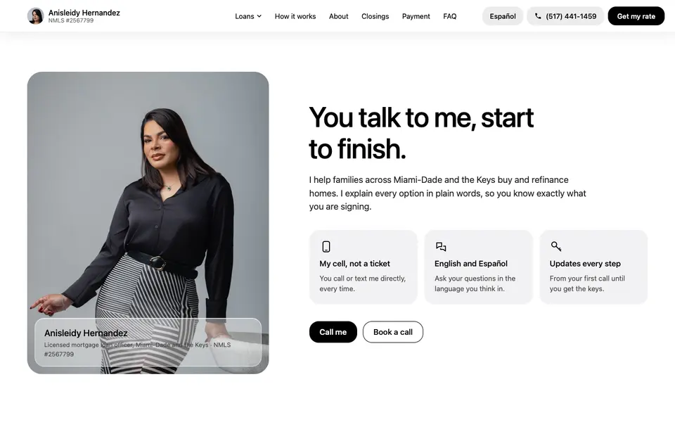
On her About section.
- 1The stats row came out. Recent closings, two languages and a license number mean little to a borrower, and the license is already in the top bar and footer.
- 2The text now sits centred next to her photo, so the words and the face read as one.
- 3Her name tag became light, see-through glass, so it sits on the photo without covering her.
Across the whole site.
- 1Buttons a little shorter and a little less round, so they look like a professional’s site, not an app.
- 2Sturdier, shorter arrows that stay clear at small sizes and match the weight of the type.
- 3On a phone, the main actions moved into the bottom bar, and the repeated button rows down the page were removed.
- 4Phones get their own smaller photos, and things fade in faster, so nothing lags behind the scroll.
Under the hood.
- 1The form asks one question at a time, so it never looks like paperwork.
- 2Every page has a Spanish version: ten pages in all.
- 3Phone changes live in phone-only code, so fixing the phone never moved the desktop.
Every screen asks for the lead.
A site for ads has one job: turn a visit into a conversation. Every section ends in a way to reach her, and each way is built around how her clients really talk to her.
WhatsApp, already written.
- How her clients talkMany of her Spanish-speaking clients use WhatsApp more than texts, so it has its own green tile.
- The first message is readyThe chat opens with Hi, I would like to check my mortgage options, or the Spanish version on Spanish pages. One more tap sends it.
Her card, saved in one tap.
- Everything filled inHer photo, name, title, mobile, email, WhatsApp and license number, ready to add.
- She stays in their phoneWhen they are ready to buy, she is in their contacts, not lost in a browser tab.
A form that feels like a chat.
- Four taps, then a nameWhat you want to do, the home price, your credit, and when. Then name, phone, email and ZIP.
- No pressureOne question at a time, and asking does not touch your credit.
- She calls back readyThe answers are what a loan officer asks first, so before she calls she already knows the goal, the price range, the credit and the timing. The first call can be about the right loan.
Tried, and left out.
Half of good design is what you take away. These were built, looked at, and removed.
Blue as an accent colour.
She likes blue, so we tried adding it. It looked added on, not built in. The site stayed black, white and grey, with colour only in the photos and glows.
A sunset glow behind LET'S TALK.
Orange, pink and blue glows to make the white word stand out. It made the footer busier than the rest of the page, so it went back to the plain white word.
Apple-style depth on the same word.
Soft shading inside each letter. Also reverted: the plain white word was cleaner.
Stats in the About section.
Recent closings, languages, license number. Numbers without meaning to a buyer. Her story reads better without them.
A menu button in a circle.
The first menu icons all sat in containers. A circle made it look like a button within a button. It became three plain lines.
A homes for sale section.
A placeholder for live listings. It was taken out to keep the page about her and the loan.
What we built for Anisleidy.
A site that introduces her first, answers the money question fast, and keeps her one tap away.